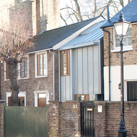
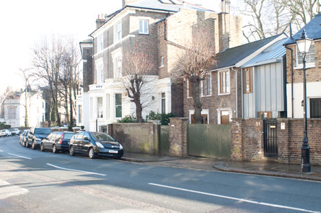
English architect John Glew has introduced new fenestration and a zinc-clad extension to this mock-Georgian house in north London, squeezing the new structure into a wedge of land between the house and its neighbour.
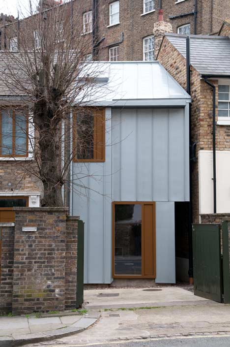
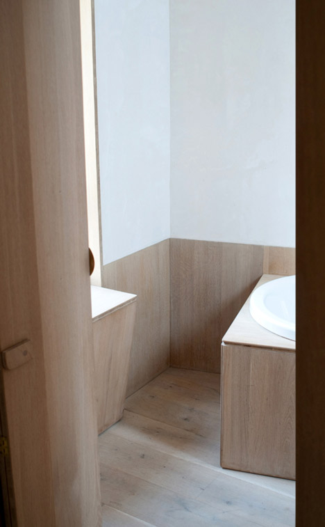
The tapered extension comprises a sitting room and pantry on the ground floor, and bedroom with a bath on the first.
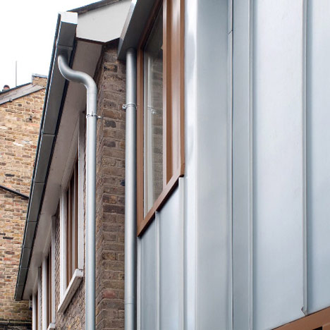
51A Gloucester Crescent’s existing windows have been replaced with frames to match those of the new extension, while the existing facade will eventually be rendered a milky grey.
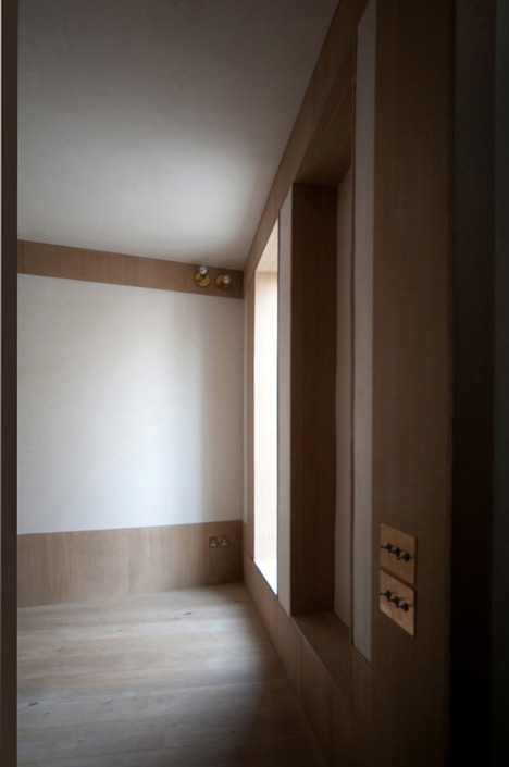
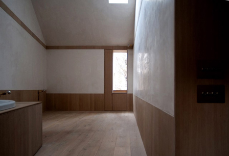
The extension’s interior has white plaster walls with brass light fittings, and oak skirting boards, picture rails and window reveals.
All photographs are by John Glew & Iris Argyropoulou.
Here’s some more from the architect:
51a Gloucester Cresecent London Nw1
.
This addition and remodelling to a 1950s developer’s cottage comprises a two-storey timber-framed extension clad in silver-blue anodised zinc and new, vertically emphasised timber fenestration to the existing house.
We have sought to replace the pretence of a mock-Georgian building with a more credible plainness in order to create a new whole, in the process posing questions above and beyond the client brief; when adjusting or adding to a house of this kind how does one design and address what is appropriate to the ambition and discipline of architecture?
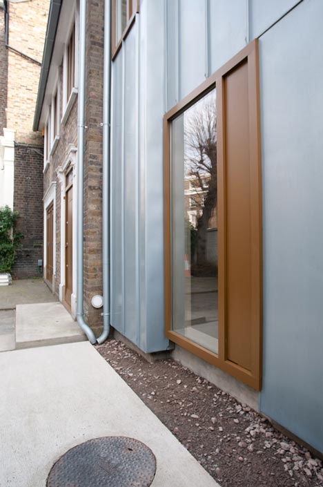
On the cladding of the extension, vertically banded standing seams rising 25mm beyond the building’s face create a secondary, fragile plane, effecting a thin, drawing-like tautness, as though the façade had been traced rather than constructed.
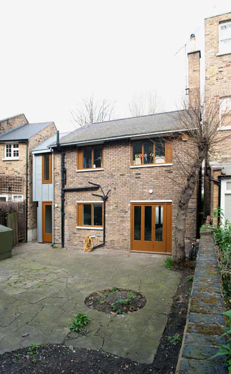
On the existing building –its new windows with their retained stucco frames close to the external brick face– the wall reads more as a surface than a solid mass, rhyming with the fenestration of the extension and reinforcing the effect of one impossibly thin surface over two very separate buildings.
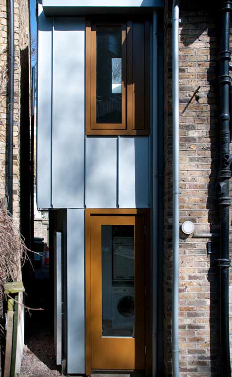
Combined with the blue zinc cladding, the cinnamon-like ginger-brown paint on the new windows evokes a changing illusion of space through the optics of colour –either a flatness or a depth depending on lighting conditions and place of viewing.
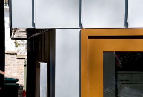
An oversized window to the small new downstairs sitting room sits in a thin wall, while above, the smaller scaled-down window sits in a thick wall, forming an asymmetric bay –or bookend– which visually props up the old house. The brickwork of the existing house will eventually be washed with a milky Danish limestone render, intended, like the new fenestration, to complete the effect of a seamless new whole.
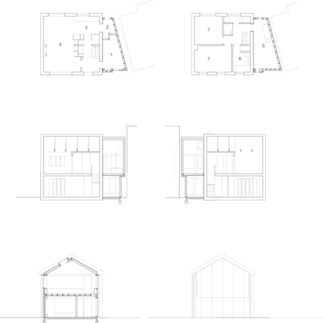
Inside, the reconfigured plan has created three additional rooms –a sitting room, a pantry and a bedroom with a bath. The plan form of the new extension has been determined by party wall negotiations and the need to accommodate the length of a double bed, the irregular site geometry creating a distorted and exaggerated horizontal and vertical internal perspective, acknowledged in the design.
The existing interior is transformed by restrained additions and seemingly simple interventions to the existing fabric: new vertically emphasised windows allow more light into the previously dark interior, opening up views to the front and back gardens and beyond, while throughout, brass light fittings and grey zinc-plated ironmongery provide a series of faint dotted elements placed strategically on the plain wall surfaces.
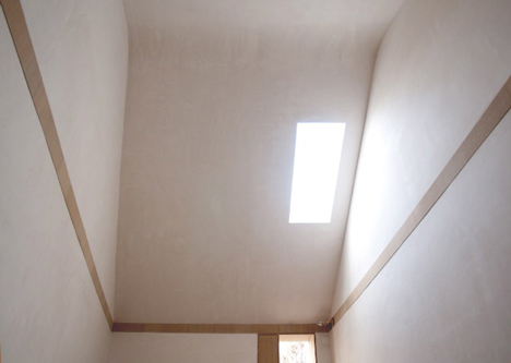
In the new sitting room and bedroom, powdery white plaster walls are bound by oak tri-ply window reveals and tall oak skirting and picture rails which project a mere 3mm beyond the walls. Like the zinc seams on the outside, the end grain of the oak tri-ply looks almost drawn on, a secondary two-dimensional frame around the windows and doors. The insubstantial colour of the plaster enhances the overall impression of fragility.
Click above for larger image
While materials and detailing are consistent throughout, each new room has its own very particular qualities. In the sitting room the low-cilled, over-scaled window frames a view which resembles a traditional Japanese raked garden. In the bedroom, the base of a white enamel bath is sunk into a timber box while its curved rim rests on the lift-up top whose thin, rounded, articulated edges bely its weight and bulk.
Click above for larger image
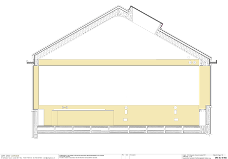
An unlined rooflight appears to hover just below the curved ridge of the sheet-like ceiling. The sparse aesthetic of the new rooms aims to achieve a calm but intense simplicity. Tempering the facade’s deliberate artifice, restraint is exercised throughout to calibrate the perception of spaces and to ensure that detail is always in support of the whole. Another potent characteristic of this project is the way in which the spaces described cannot be absorbed at once. The transformed exterior is unashamedly new but at the same time the building is a background, its composure and the ambition of its sophistication alluding to but never aping the crescent whose elegant characteristics surround it.


所有评论