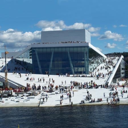
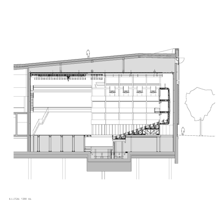
Here are some more photographs, plans and renderings of the new Oslo Opera House by Norwegian architects Snøhetta.
See our previous story for more photographs and info.
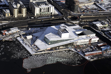
Above photo © Statsbygg
The following information is from Snøhetta:
–
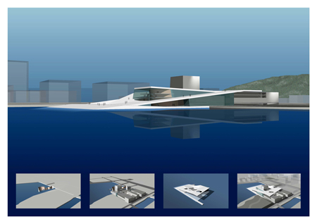
The operahouse is the realisation of the winning competition entry. Four diagrams, which were part of the entry, explain the building’s basic concept.
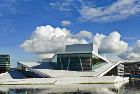
Above photo © Statsbygg
1: The wave wall
Opera and ballet are young artforms in Norway. These artforms evolve in an international setting . The Bjørvika peninsula is part of a harbour city, which is historically the meeting point with the rest of the world. The dividing line between the ground ’here’ and the water ‘there’ is both a real and a symbolic threshold. This threshold is realised as a large wall on the line of the meeting between land and sea, Norway and the world, art and everyday life. This is the threshold where the public meet the art.
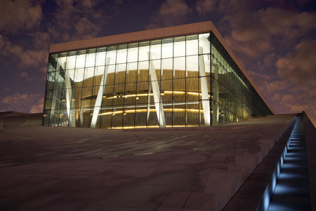
Above photo © Erik Berg
2: The Factory
A detailed brief was developed as a basis for the competition. Snøhetta proposed that the production facitlties of the opera house should be realised as a self contained, rationally planned ‘factory’. This factory should be both functional and flexible during the planning phase as well as in later use. This flexibility has proved to be very important during the planning phase: a number of rooms and room groups have been adjusted in collaboration with the end user. These changes have improved the buildings functionality without affecting the architecture.
Above photo © Erik Berg
3: The Carpet
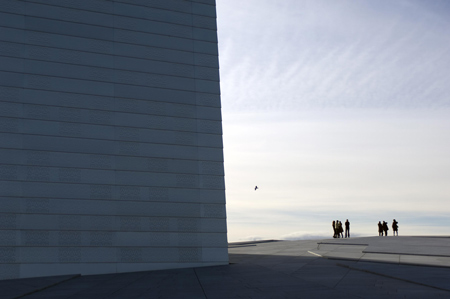
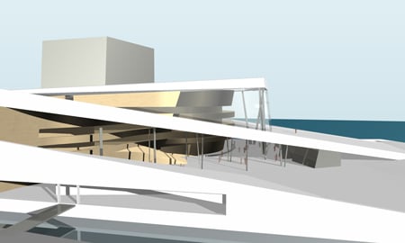
The competition brief stated that the opera house should be of high architectural quality and should be monumental in it’s expression. One idea stood out as a legitimation of this monumentality: the concept of togetherness, joint ownership, easy and open access for all. To achieve a monumentality based on these notions we wished to make the opera accessible in the widest possible sense, by laying out a ‘carpet’ of horizontal and sloping surfaces on top of the building. This carpet has been given an articulated form, related to the cityscape. Monumentality is achieved through horizontal extension and not verticality.The conceptual basis of the competition, and the final building, is a combination of these three elements – the wave wall, the factory and the carpet.
4: Urban situation
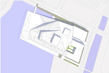
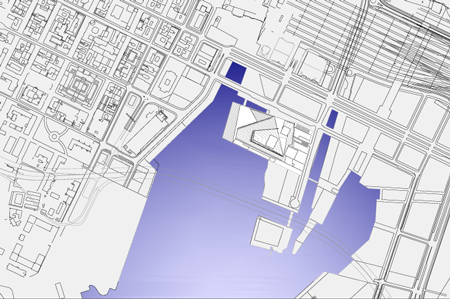
The opera house is the first element in the planned transformation of this area of the city. In 2010 the heavy traffic beside the building will be moved into a tunnel under the fjord. Due to its size and aesthetic expression, the opera house will stand apart from other buildings in the area. The marble clad roofscape forms a large public space in the landscape of the city and the fjord.
The public face of the opera house faces west and north – while at the same time, the building’s profile is clear from a great distance from the fjord to the south. Viewed from the Akershus castle and from the grid city the building creates a relationship between the fjord and the Ekerberg hill to the east. Seen from the central station and Chr. Fredriks square the opera catches the attention with a falling which frames the eastern edge of the view of the fjord and its islands.
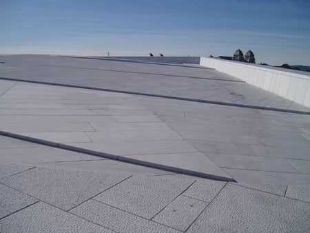
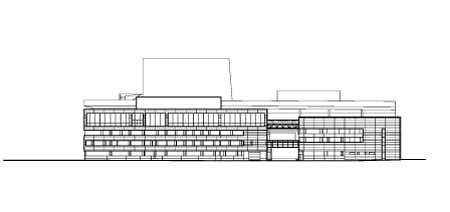
The building connects city and fjord, urbanity and landscape. To the East, the ‘factory’ is articulated and varied. One can see the activities within the building: Ballet reheasal rooms at the upper levels, workshops at street level. The future connection to a living and animated new part of town will give a greater sense of urbanity.
Collaboration with artists
For Snøhetta, close collaboration with artists has always been an important part of building projects. As early as the competition stage, artist were invited in as collaborators, and the wished to continue this from the beginning of the design phase. Snøhetta have tried to avoid having artist apply ‘decoration’ to the architecture, prefering to allow for an open dialogue between artists, artisans and professionals with various approaches to important building elements. With the operahouse, the architect intended that both the large marble clad roofscape and the aluminium clad facades should be approached as collaborative endeavours.
An early collaboration was established for the sone roof with artists: Kristian Blystad, Kalle Grude og Jorunn Sannes. One year later, in accordance with the guidelines for state funding building projects, a committee for integrated artwork was established. This committee engaged the artists Astrid Løvaas og Kirsten Wagle to collaborate on the design of the metal cladding elements.
Choice of materials
The materials, with their specific weight, colour, texture and temperature, have been vital to the design of the building. Snøhettas architecture is narative. It is the materials which form the defining elements of the spaces. It is the meeting of the materials which articulates the architecture through varied detail and precision.
In the operahouse, three main materials were specified as early as the competition entry: White stone for the ‘carpet’, timber for the ‘wave wall’, and metal for the ‘factory’. During the continued work on the project, a fourth material, glass, which allows for the exposure of the underside of the ‘carpet’, has been given specific attention.
Stone
After an international tender competition, the italian marble, La Facciata, was chosen. This is a stone which, in common with other marbles, retains its brilliance and colour even when wet. It has the necessary technical quality in terms of stabitity, density, and longevity. The producer, Campolonghi, has had the professional ability, capacity, and experience necessary for such a large and complex project.
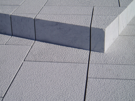
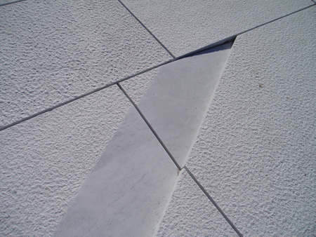
The accessible area of the ‘carpet’ is approx. 18,000 m2. Its detailed design has been important: the architect desired that it should not interfere with the general dorm of the building but that it simultaneously was articulated enough to be ineresting at close quarters. Together with the artists several alternatives were proposed before a particular non repetitive pattern with integrated riased areas, special cuts, various surface textures, and specific details were designed to articulate the main geometry.
Timber
Oak has been chosen as the dominating material for both the ’wave wall’ and the main auditorium. For the wave wall it has a light and varied surface. Oak is used throughout for the floors, walls and ceilings. The wave wall has a complex organic geometri made up of joined cone shapes. It is also an important acoustic attenuator within the foyer space. To achieve these goals it is made up of smaller elements which can deal with the changing geometry and provide acoustic absorption. Inside the auditorium oak has been chosen for a number of reasons: It is dense, easily formed, stable and tactile. The oak has been treated with amonia to give a dark tone. Here too oak is used for floors, walls, and ceilings, as well as balcony fronts, and acoustic reflectors.
Metal
An operahouse is designed and built to have a long lifespan. This means that a simple, modern metal cladding, such as we associate with factories and workshops, needs to be re-evaluated and redesigned. After a consideration of aesthetics, longevity, maleability and the possibility to make very flat panel, aluminium was chosen. To give the panels further quality, a collabarative process was begun with two artists.
The design team initially aimed for an industrial modulrity but that the panels themselve should have greater visual quality. The panels were punched with convex spherical segments and concave conical forms. The pattern was developed by the artists based on old weaving techniques. In all, eight different panels were designed which give a constantly changing effect depending on the angle, intensity and colour of the light playing on them.
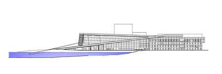
Glass
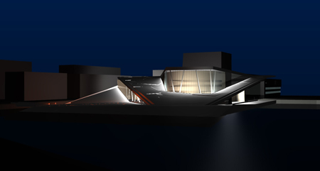
The high glass facade over the foyer has a dominant role in the views of the building from the south, west, and north. Early in the project it was realised that this glass faced was more important than previously assumed, both during the day and night when it would act as a lamp illuminating the external surfaces.
The glass façade is up to 15 meters high. It was the architects intention to design a glass construction with an absolute minimum og columns, framing, and stiffening in steel. The solution was to use glass fins where minimised steel fixings are sandwiched inside the laminates. The requirements for the glass’s stiffness increased due to the desire for large panels and slim joints where the panels meet. Thick glass of this sort tends to be quite green rather than transparent. It was therefore decided that the façade of the operahouse would use low iron glass.
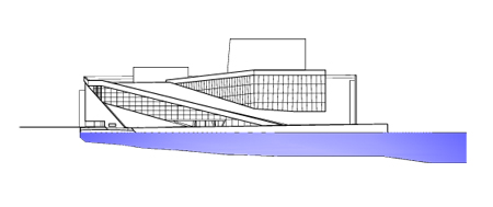
Plan solution, general arrangement
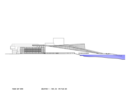
The building is split in two by a corridor running north-south, the ‘opera street’. To the west of this line are located all the public areas and stage areas. The eastern part of the building houses the production areas which are simpler in form and finish. Comprising 3 to 4 storeys above ground. There is also a basement level – U1 – below this part of the building. The sub stage area is a further 3 storeys deep.
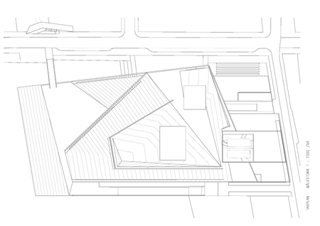
The building’s western part
A marble clad plaza leads the visitors to the foyer and other public areas. A secondary entrance on the north façade gives firect access to the restaurant and foyer. To the south, the foyer opens up to the inner oslo fjord and views of Hovedøya island. To the west and north it is views of the city which dominate, while the auditoria lie to the east. There can be as many as 1900 audience members in the building. 1400 in the main auditorium, 400 in stage 2 and 150 in rehearsal room 1, which doubles as a black box theatre.
There is a brasserie to the south of the foyer, a restaurant to the north and several bars which can be run separately from the performances. Service functions such as education spaces, cloakrooms, toilets, information/ticketing desk and diverse smaller rooms are located around the foyer. From the foyer, at ground level, and from the public galleries, access is provided to the two main auditoria.
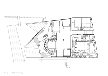
The large stage area occupies a significant part of the building footprint. Here is the main stage (16m x16m) with an 11.8m deep substage, two side stages and two rear stages, as well as a scenery hall and store. There is a free height of minimum 9m throughout these areas. Storage for the backdops is located above the rear side stage. Finished scenery for several performances and acts can stand ready on the rear and side stages as well as below stage. In addition, the large rehearsal room is located in direct connection to the stage areas and can provide further scenery storage should this be necessary.
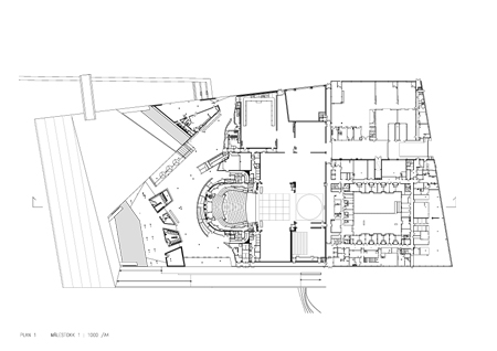
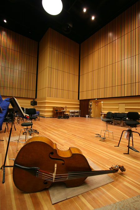
The orchestra rehearsal room – an acoustically sensitive space – is also located in the western part of the building – at basement level. This hall is the orchestra’s most important rehearsal space and can also be used for recording purposes. The requirement for variable acoustics is achieved by the use of adjustable panelling and drapes. The room can achieve similar acoustics to the main auditorium.
A passage from the foyer, along the southern façade, leads to rehearsal room 1 allowing it to be used as a public performance space. The same area of the building at the upper levels houses sponsor lounges and a VIP room.
The building’s eastern part
To the east of the ‘opera street’ are located all the production and administration areas; approx 1000 rooms of varing size and function. The opera street is the main communication artery for all the employees – almost 600 persons from more than 50 professions.
A large loading dock running east west splits the back of house area in two. Here also, the dimensions of the space are given by the size of scenery elements, up to 9m high.
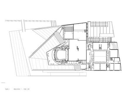
To the north lie the ‘hard workshops’ where the scenery is made. Several professions have their workspaces here, carpenters, metalworkers, painters and decorators. The finished scenery is moved through the loading dock and directly into the rear stage area.
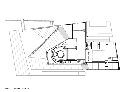
To the south lie all the other functions necessary to serve the needs of the dancers and singers: ‘Soft workshops’ with costume production, wigs, hats, gloves and make up areas. Also administration and changing rooms are located here. A spaceous green courtyard is at the heart of this area on levels U1 and Ground. Most of the changing rooms house 4 performers with all the necessary costume and make up for each show. The rooms are also intended to be a place for relaxing and concentrating and are therefore equipped with a day bed.
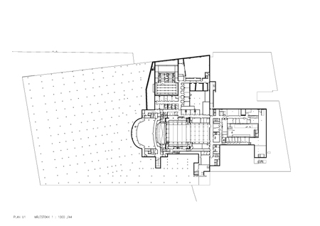
The opera and ballet departments have several large rehearsal rooms in this zone on levels 3 and 4. and it is possible to transport scenery from the loading dock to the rehearsal spaces on level 3 via an elevator with a clear height of 6m. The largest of the rehearsal rooms has a clear height of 9m and is as large as the main stage. This allows the dancers to practice a complete performance. All these spaces have walls with acoustic attenuation. There are also a number of small rehearsal rooms at palan 2.
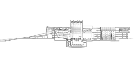
The wig makers, make up artists, and dressers are located closer to the stage at level 1 (ground). From here the artistes can access the stage areas at ground level or from the basement. At level 2 there are msic archives, offices, and support functions for the orchestra as well as a health center and gym. Level 3 houses the administration department with a large canteen wo the south with a terrace overlooking the fjord.
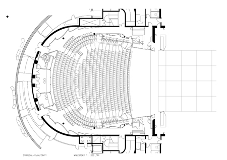
The main auditorium
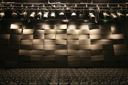
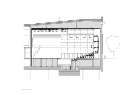
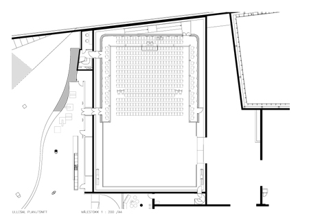
The main auditorium is a classic horseshoe theatre built for opera and ballet. It houses approx. 1370 visitors divided between stalls, perterre, and three balconies. Technical spaces occupies the area above balcony 3. The orchestra pit is highly flexible and can be adjusted in height and area with the use of three separate lifts. On each side of the stage are mobile towers which allow for adjustments in the proscenium width for ballet or opera without damaging the acoustics of the hall. Reverberation time is fine tuned using drapes along the rear walls and control rooms for sound and light are located to the back of the hall.
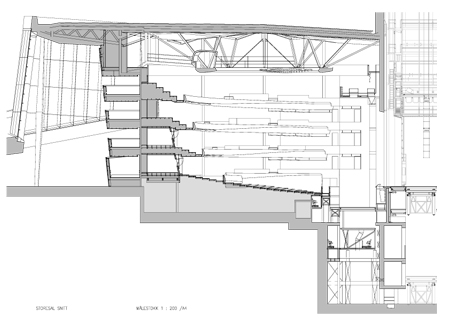
The form of the auditorium is based on several relationships: short distance between the audience and the performers, good sight lines, and, above all, excellent acoustics. The architectural intentions for a modern auditorium with traditional, acoustic musical performance have been developed in parallel with requirements for visual intimacy and acoustic excellence. In older opera halls acoustic attenuation was often achieved by using rich decorative, sculptural elements on most surfaces. In this case the requirements have been met with a clean, carved aesthetic using a modern formalistic language.
The requirement for a long reverberation time results in a room with a large volume. In this case the volume is increased by the use of a technical gallery which cantilevers out over the walls below, giving the hall a T shaped section. The main structure of the stone clad roof above is included in the volume of the hall rather than being hidden behind a false ceiling.
Optimum acoustics have been achieved by the following methods:
We have, also as an aesthetic move, given the balcony fronts a geometry which changes relative to its location in the room and the acoustic function necessary in each location. At the sides the form reflects sound back down to the audience whilst at the rear it sends soungs in multiple direction to avoid focussing. The oval ceiling reflector visually finishes the hall and also reflects sounds in very specific ways. The same principle is used as with the balcony fronts. The rear walls at each level are made up of convex panels to avoid focussing and to spread sound evenly through the room.
The geometry of the interlying walls, main orchestra reflector, and the mobile towers are modulated to scatter sound around the space. Using timber staves of varying dimensions to modulate sound of different wavelengths. All the surfaces are of relatively dense materials to avoid high frequency vibrations. Balcony fronts are 50mm solid oak where the rear wall panels are 100mm MDF with oak veneer.
The double curvature of the balcony fronts and oval ceiling ring are made of pre-fabrcated oak elements made of solid stave glued together, amonia treated and the routed from 3D computer drawings before oiling and polishing. The dark coluour is particularly suited to the theatre space and the oak gives a rich, warm, and intimate feel to the space. The seats are designed to absorb as little sound as possible. Materials are dark timber and a specially design orange red fabric as a counterpoint. Text display screens are built into the seat backs so that the audience can individually choose to read the libretto in a number of languages. The auditorium is illuminated by a snøhetta designed chandelier in the form of a shallow lens as well as inbuilt LED fittings in the cailigs and floor.
The chandelier
The chandelier, which is suspended inside the oval reflector, is an important element in the hall as performs several tasks. It is the auditoriums main source of illumination, using LED for the first time in such a setting. It weighs 8.5 metric tons and has a diameter of 7m. It is made up of 5800 hand cast glass crystals through which 800 LED lights shine. This bathes the room in a cool diffuse light. The whole chandelier can be lowered to the floor for maintenance.
It is also an important acoustic reflector. This explains the particular form which scatters and diffuses sound. The distance between the strips of crystals increases towards the stage to allow a greater amount of sound to pass through and therefore contribute to the reverberance of the space. It is placed forward of the centre in order to allow unhindered sightlines from the follow spot room on the rear of the oval reflector.Finally it forms a visual closure to the hall itself to take attention away from the technical spaces and structure above.
The stage curtain
The stage curtain is also an important element in the auditorium. Together with the chandelier and seat fabric it is a contrast to the dark timber. It has been made by the american artist Pae White, following an international competition. She has worked with digital images of aluminium foil which reflects and adopts the colurs of the auditorium. These images are then transferred to a computer driven loom.
Stage 2
Stage 2 can, depending on the chosen seating configuration, house an audience of up to 400. It will be used by both opera and ballet, as well as for banquet functions, rock concerts, experimental performances and children’s theatre. It is a multi use hall where the seats, which are on large wagons, can be repositioned in a number of different configurations. There are 2 large elevators which form an amphitheatre, orchestra pit and transport seating wagons for storage in the basement. The area which is normally the stage is made up of removable floor elements. The auditium has no flytower but rather an extensive motorised pully system to hang and transport scenery, backdrops and acoustic reflectors when necessary. A 9m high sliding gate connects the stage area with the back stage zones and scenery stores. The reverberation time in the hall can be damped down for amplified performances.
The client required an auditorium with the flexibility of a black box but with an amount of architectural quality and identity. These to requirements are generally considered to be mutually exclusive, but after close discussions with the end user, a solution was found where of a black box has a high quality cotrasting, freestanding structure placed inside it. This ‘object’ has rounded, high gloss, red paneling on the outside and a cooler metallic silver finish in towards the stage. Four technical bridges span across the space at high level housing lighting and ventilation and forming an important visual and acoustic ceiling.Between the columns, large, black painted doors and removable panels are used to adjust to different configurations. These panels have also been given acoustic consideration.
Interiors
The exterior of the operahouse becomes diffuse as night falls. The large timber ‘wave wall’ in the foyer is illuminated and the building takes on a completely different character. The interior becomes the façade. It shows how interdependent the interior and exterior of the building are.
The building’s architectonic ideas and concepts have also been used in the buildings interiors. The task has included considerable interior planning based on the schedule of rooms, functions, colours, materials, and surface treatments, coordinating lighting schemes, technical instalations, built in furniture, wet rooms, kitchen solutions, elevator cars, fittings and fixtures. It has also encompassed design and coordination of the end user equipment and loose furnishings. Cooperation between the various architectural diciplines has been vital.
Interiors concept, public spaces
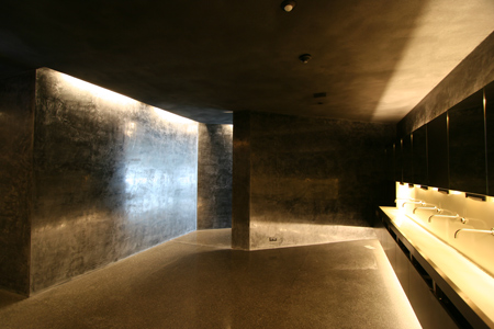
The experience of the buildings exterior clearly requires that the interiors be of equally high architectural quality. On entering the building one is first lead in under the lowest part of the sloping roofscape. Where the ceiling falls to meet the floor.
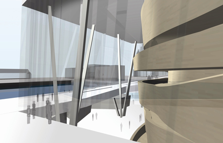
This area is used for the public cloakroom where a copse of slim columns hold the visitors coats. Further out into the foyer, four volumes hold up the roof. The perforated, illuminated cladding of these is another example of integrated artwork. In this case by Olafur Eliasson. These white form house the public toilets. Moving out into the open space of the foyer one is below an expance of white, sloping cailing held up by angled white columns which meet in clusters at floor level. The grand staicase is peeled out of the wooden wall and leads up to 3 galleries around the auditorium. Thus providing access to the upper levels of the hall.The interior of the wooden wall has an intimate feel in contrast to the open, white foyer.Dark light locks lead the audience into the heart of the building. The main auditorium.The feeling is of being inside a carved out piece of timber, or perhaps within a musical instrument.
Furnishings and equipment in the public areas
The interior, from cloakroom to auditorium can be described as a formalistic journey which takes the visitor from the open unknown to the enclosed and secure. The level of abstraction to be seen in the outer spaces ahs made it natural to minimise the number of recognisable builing elements and details. At the same time it has been a clear aim that the furniture elements use the same design language as the building as a whole.Larger elements such as bar counters, shop fittings, ticketting desk, and cafè interiors are either integrated in larger building forms or designed as free standing sculptural forms in white corian. These can be completely closed down when not in use.
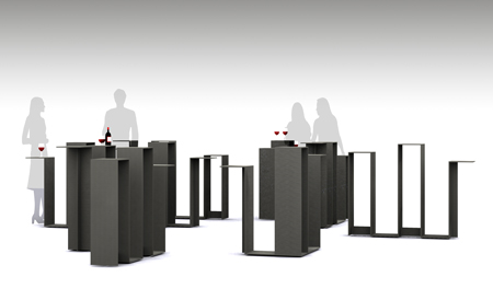
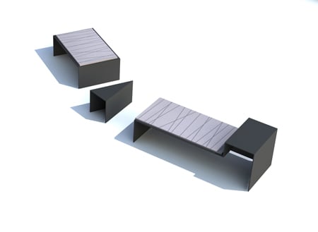
The cloakroom and foyer are further furnished using simple seating forms and high tables made of steel plate coated with industrial rubberized black lacquer. Upholstery is with flat sheets of felt and sheep skin. Signage is made of the same black steel and white glass surfaces complete a number of the interior elements.
Furnishing of the production areas
These zones are designed around eronomics, functionality, and experience. The harde workshops are rational rooms where the logistics of mechanisation dominate the design. Wig and make-up workshops have been provided with specially designs workstation modules specific to the user’s requirements. The costume department, which is a hectic space full of activity has been given solution specific to its complex logistics.
The three artforms; Ballet, opera, and orchestra all have their requirements for changing rooms fulfilled with standardised but purpose built furniture. However, the orchestra have larger, 10 man changing rooms with areas for unpacking instruments, rest, and changing prior to a performance, amd with shared access to toilets and showers. The Ballet, choir and soloists have smaller 4 or 6 man rooms with person specific places and showers shared with the neighbouring room. For the ballet these rooms function as a home base in a day filled with training and rehearsals.
All the changing rooms are specially design with fitted, standardised furniture, make up tables, day beds and cupboards.
A great deal of work has gone into designing the rehearsal spaces for the different groups. These are important working spaces, with optimised acoustics, ventilation, and lighting. The intention has been to provide a great deal of spacial quality and the acoustic wall panelling in particular contributes to this.
Material use in the production areas.
The brief for these area specifies that they should be simple and inexpensive. This means that they are of general office quality with painted walls and linoleum flooring. This works well as a neutral background to the opera’s colourful costumes and stage elements which enliven the spaces. The colour palette is therefor quite simple and neutral.
The open courtyard forms a central reference point to the production areas and the corridors which encircle it are given a dark colour to make orientation easier. The rehearsal rooms have different characters for ballet, opera and choir.. The ballet spaces are light and airy with views over the fjord to the south. Whilst the choir space is more introvert with daylight from a high clerestory window facing east. Enclosing the musical experience. Colours and materials have a warmer, darker hue.
Furniture and end user equipment
Even though the building is large, there is little loose furniture. We have attempted to to simplify and standardise the choice of furniture and relate it to the building’s architectural design. A small number of quality furniture producers have been chosen and the pieces have a clean, contemporary design which is simultaneously classical enough to be timeless.
Landscaping
The opera’s landscape comprises of the marble roof, additional marble clad areas, and the areas between the building and the surrounding streets. Access to the plaza and the main entrance is over a marble clad footbridge over the opera canal. The plaza forms a part of a public promenade and cycle lane which continues around the west and south sides of the building, and eventually coming to a planned bridge over the Aker river to the east.
As early as the competition entry, Snøhetta proposed that the roofscape should be openly accessible to the general public and that it should be clad with white stone. Today the building’s defining feature is the characteristic geometry of the roof as it rises from the fjord and is laid out like a carpet over the public areas. An important move has been to introduce channels along the roof edges with ramps and steps. This allows the integration of regulation height balustrades with raising the line of the roof itself. To achieve enough acoustic volume in the auditorium, the roof has been raised indepently inside the line of the balustrades. This has created a new viewing point from which the city and the fjord can be experienced. The roofs are mostly too steep for wheelchair use but access to the near flat, upper areas is prvided via a dedicated elevator.
The surface treatment of the stone, its pattern, cuts and lifts which create a shadow play, have been designed in close collaboration with the artists. The white marble is ‘La Facciata’ from the Carrara quaries in Italy. The north facede and all the stone cladding which is in contact with water is a norwegian granite called ’Ice Green’ Prototypes and tests at full scale were studied at the contractor’s facitities before the final choices were made for colour nuance and surface texture. A running quality control regime has been implemented throughout the production process.
Adjacent areas During the building period it became clear that rapid and considerable settling of the ground level around the Large areas of gravel which is designed to take local vehicular traffic have been laid around the building footprint. This is easy to adjust as the ground sinks relative to the building which is founded on the bedrock. Trees are planted in the gravel areas, and a zone of street furniture is located along the pavement line with cycle parking, benches and specially designed streetlamps in stainless steel. The pavements are of asphalt with black granite edges and larger areas of granite paving wto highlight the entrances to the restaurant, opera street, and stage entrance. The dark grey colur palette is a clear contrast to the light stone and aluminium of the building itself within a cool monochrome language. Landscaping of the surrounding areas has been designed in collaboration between Snøhetta and Bjørvika Infrastructure who have been responsible for the planning of the street around the operahouse.
Courtyard
The courtyard is a garden in the middel of the production area of the building. Surrounded by facades of black glass, aluminium and timber and open to the sky. There is direct access to the courtyard from ground and basement levels while the upper levels experience it as a green lung deep inside the building. In front of the sound insulated rehearsal rooms at basement level, vegetation has been planted to form a screen. The floor of the courtyard is a composition of timber dekking, white marble, and green areas. A marble cladd stair connects the two levels. Grasses, climbing plants and perennials are planted around clusters of cables reaching up to the upper levels and providing shade to the facades.
All images © Snøhetta except where stated otherwise


所有评论