Barcelona architects and designers Deardesign have completed a flagship store for mother-and-son fashion designers Lurdes Bergada and Syngman Cucala in Barcelona.
Click for larger image
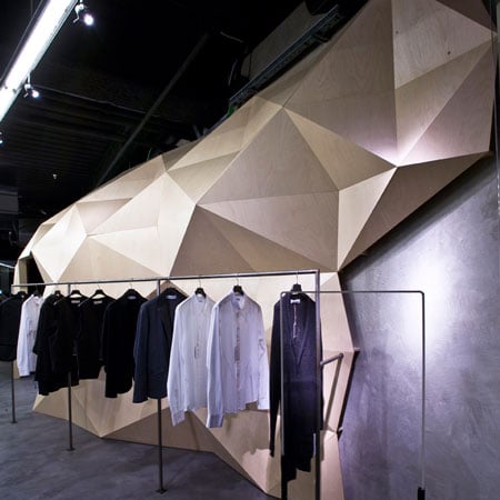
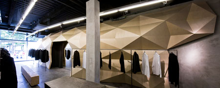
The store, located in the L’illa Diagonal shopping mall, is divided in two by a faceted beech tunnel stretching the length of the shop.

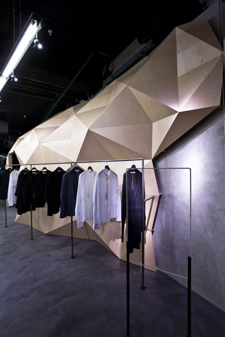
The wall comprises 1,000 uniquely shaped wooden panels held together by 2,400 screws.
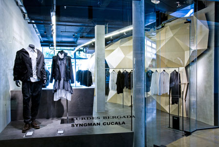
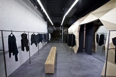
The interior features exposed concrete columns, industrial-like resin flooring and simple, unfinished wooden benches.
Photographs are by Pol Cucala. Here’s text from Deardesign:
–
A Contrasted Space, this is the new creation of Deardesign studio from Barcelona.
The new flagship store from Lurdes Bergada, Syngman Cucala, is now installed in one of the best shopping malls in the city centre, L’Illa Diagonal.
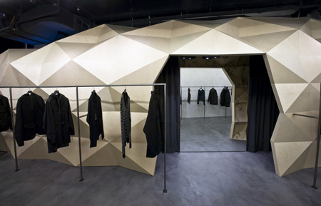
The store is divided into two clearly defined areas which, on the one hand, link every technical aspect of a clothes store behind a “wooden skin” and on the other hand, keep clothes as the main focus. The project seeks to preserve the common characteristics of Lurdes Bergada, Syngman Cucala’s existing spaces: industrial, different and minimalistic, adding a touch of the contemporary in it’s architecture.
The principal idea was to open the space and allow a view onto the shopping mall’s park. This would give clients the sensation of shopping in a space full of natural light, as though they were in a street store.
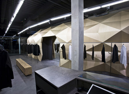
Here Deardesign apply the main philosophy defined by l’Illa Diagonal Mall, interpreting the act of buying in a mall as a “shopping avenue”.
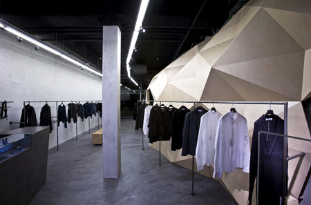
The park is another decorative piece of the interior. From the park the back façade attract clients in the same commercial way as the interior facade of the shopping centre.
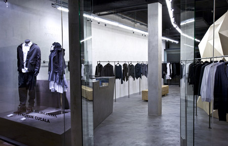
Therefore the design team decided to bring together all the technical functions of the store (storage, fitting rooms, electrical quarter, and a 2nd small window) in a huge unique wood structure made from 1000 pieces of wood and put together with 2400 screws.
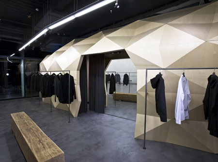
The wooden skin allows all large structures to be hidden, therefore leaving the roof clear.
From it’s interior, the “skin” reveals to visitors all of it’s extremely technical constructive secrets, bringing to mind fabric, turn-ups, stitching, etc… This reflects the real importance of technicity in clothes making and enhancing the concepts transmitted by the brand: simplicity, purity, and industry.
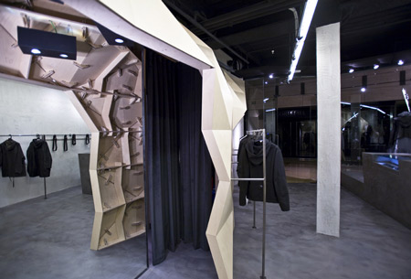
The installation made of irregular triangles appears rock-like, a contemporary cave. The natural beechwood stands in contrast with the opposite wall, made of concrete.
Each triangle is unique and numbered to make the construction easier.
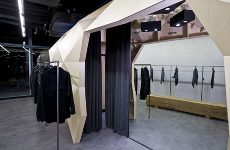
Most existing stores of the brand preserve traces of the history of the buildings in which they are installed. The aim of the project is to respect the original context and to re-enforce the industrial characteristics of the building. Basic materials such as concrete for the walls and fine cement on the floor are used. These simple materials simplify the arquitectural reading of the store and strengthen the concept.


所有评论