
Copyright - Jeremy San, Image Courtesy of Studio SKLIM
Although working on your laptop at a local Starbucks is always comfy and cozy and although it has become the “ever-present platform” to begin work an actual office environment is always necessary in the long run.
“Work is where you are, work has become a state of mind.”
Paola Antonelli, Curator of MoMA’s Dept. of Architecture and Design -2001 Exhibition “Work Spheres”.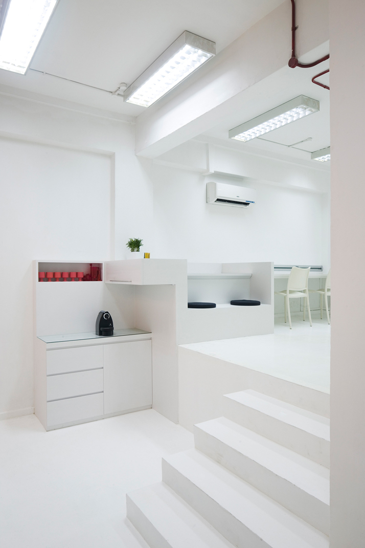
Copyright - Jeremy San, Image Courtesy of Studio SKLIM
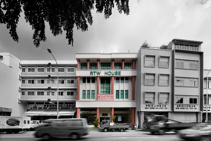
Kevin Lim, of Studio SKLIM was asked to design an office space in a refurbished postwar building in Singapore’s CBD outskirts; the office would act as the home for two companies, an IT company and a multimedia setup company. The program brief would therefore have to be treated in such a way as to allow for these companies to work individually and interrelatedly. The space had to reflect the ethos of these companies: flexibility, technology and creativity. 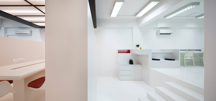
Copyright - Jeremy San, Image Courtesy of Studio SKLIM
Copyright - Jeremy San, Image Courtesy of Studio SKLIM
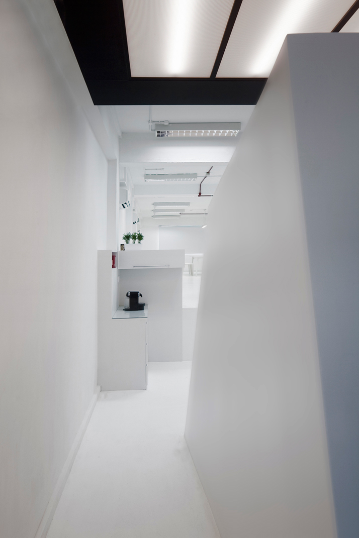
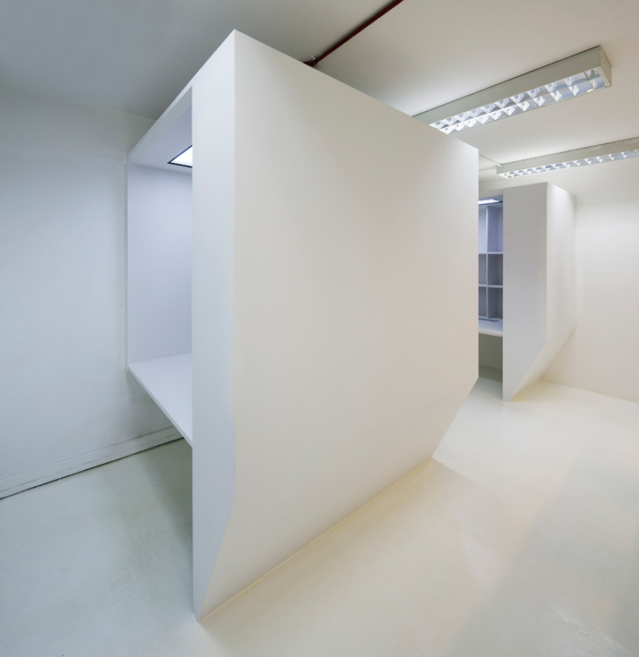
The original space was long and narrow with split levels, offering the possibility of a raised space. The raised space in some cases has been organized into clusters which have been assigned a specific function. Overall, the space has been organized into eight clusters: The Boss
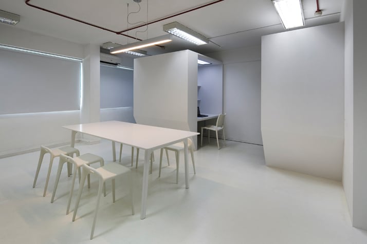
Boxes, Long Work Top, Discussion Table, Welcome Mat, Sanitary and Storage, Recharging Point, Twist Platform and the Multi-media Corner. The configuration of the program has been kept in an open plan with the clusters being set about; the only cluster which has been secluded is the Sanitary and Storage which allows for a diverse overlap of working paths. Throughout the long and narrow office, the ceiling and wall conditions were left unaltered as much as possible, along with the existing light fixtures.
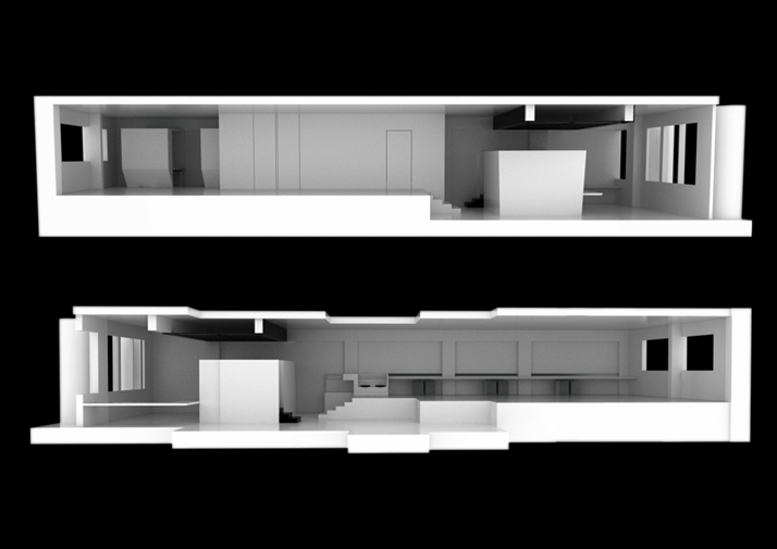
Sections, Image Courtesy of Studio SKLIM
Copyright - Jeremy San, Image Courtesy of Studio SKLIM
Copyright - Jeremy San, Image Courtesy of Studio SKLIM
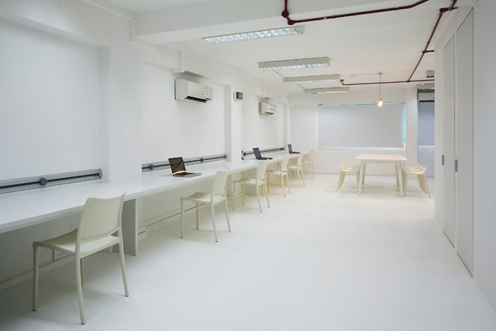
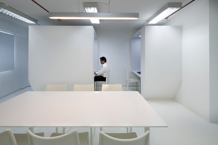
Studio SKLIM wanted to reflect the ethos of the companies within the office - flexibility, technology and creativity. The formation of hot desking, informal working clusters and semi-private cubicles creates a flexible working environment for the employees whereas, some privacy and a more peaceful environment had to be designed and named The Boss Boxes. The ever-changing size of the workforce also called for flexible working spaces which would meet the demands of the office. As a result the white “Long Work Top” was designed and incorporated into the office. Due to the nature of their work as well as the nature of any modern day office, the use of technology was a crucial aspect and concern of the client. “An ingenious power strip of data points, power supply and telecommunication points to be accessible at any location along this table expanded the number of workstations from six to ten in a few minutes. This single piece of stretched work surface became part of a greater string of furniture transforming from table top, reception seating, storage and finally to pantry space.”
Copyright - Jeremy San, Image Courtesy of Studio SKLIM
Copyright - Jeremy San, Image Courtesy of Studio SKLIM
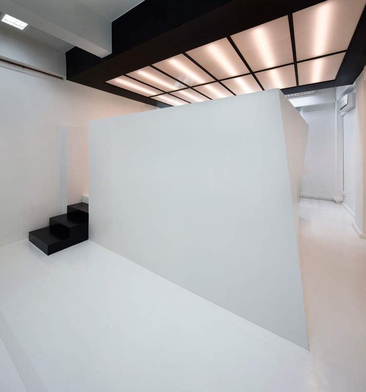
Furthermore, the Twist Platform has available storage space underneath the upraised meeting pod. The Twist Platform provides the background to an office party at the Recharging Point and also offers privacy to the operation of the multi-media setup. The black overhead lighting fixture contrasts with the entire office and suggests the differentiation of the cluster, as the event space.
Copyright - Jeremy San, Image Courtesy of Studio SKLIM
Copyright - Jeremy San, Image Courtesy of Studio SKLIM
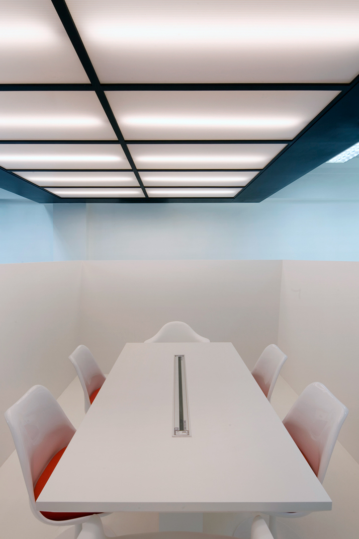
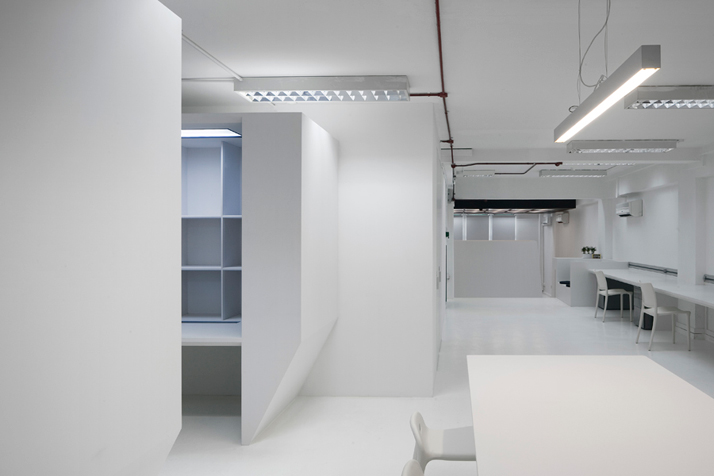
In the overall designing of this office space, “sightlines, privacy and anthropometrics were important aspects to the final geometric configuration of this space.” The office has been designed to be as comfortable as possible, as it targets to create a homely and friendly environment, while in the meantime it draws a clear line between comfortable and professional. A shade of cool white has been used throughout the office making it brighter and adding space to this large yet narrow office. The application of white has been applied to some furnishings as it aims in creating a convenient and cool office space. According to Studio SKLIM, the concept of “Thin Office” was the aspiration of remaining anonymous and providing a blank canvas where various work scenarios would add the color; the “thinness” of this space has been incorporated in this program by the organization of the spaces and their functions.
Copyright - Jeremy San, Image Courtesy of Studio SKLIM
Copyright - Jeremy San, Image Courtesy of Studio SKLIM
Client: Kido Technologies
Design Team: Kevin Lim
Gross Floor Area: 125 square meters
Copyright - Jeremy San, Image Courtesy of Studio SKLIM


所有评论