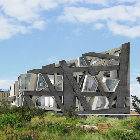
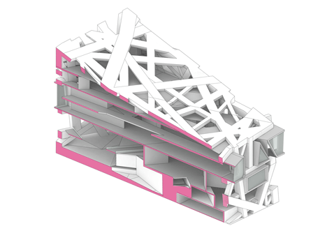
New York architecture practice Axis Mundi have designed a conceptual extension to the Whitney Museum of American Art in Manhattan, featuring a giant lattice structure.
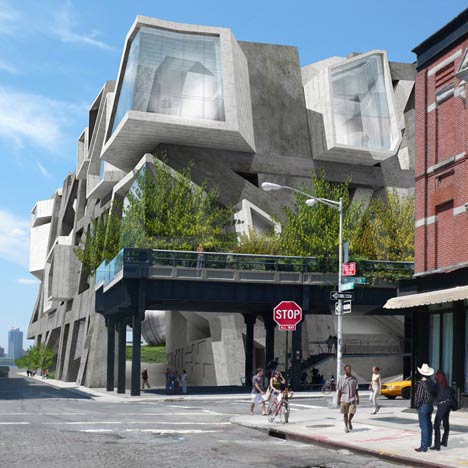
The existing museum is a 1960s concrete building by Marcel Breuer and Axis Mundi claim the extension’s exposed concrete frame would be a continuation of Breuer’s brutalist aesthetic.
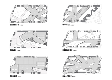
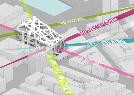
The extension would have an irregular floor plan configured around sight lines that look towards landmarks such as the Empire State Building.
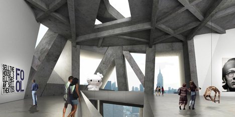
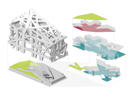
The floors would be suspended between the lattice structure without the need for interior columns.
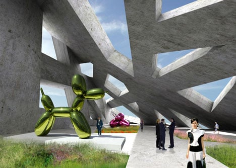
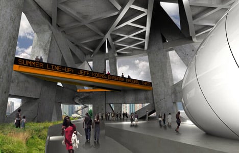
At street level a pathway would weave between an outdoor cafe, performance space, sculptures and up to a viewing platform overlooking the Hudson River.
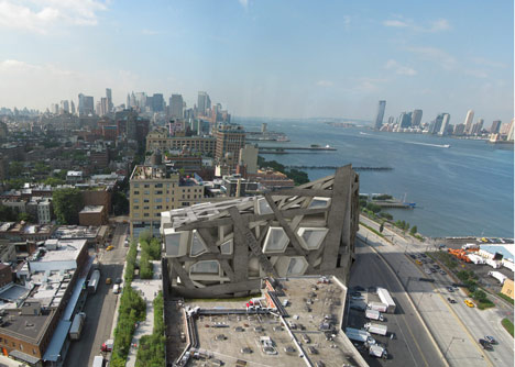
All illustrations are by Denise Pereira and Andy Vann.
Click above for larger image.
All renders by Viviane Liao and Andy Vann.
Click above for larger image.
Here’s some more from the architects:
Architectural Provocateurs Axis Mundi Imagine a Different Whitney Downtown
New York architects Axis Mundi have re-imagined the Whitney Downtown Museum with a self-initiated proposal that is raw and provocative, and as bold in spirit as the original Breuer building on Madison Avenue.
In the early 1960’s, when Marcel Breuer received the commission for the Whitney, he asked “What should a museum look like, a museum in Manhattan? Surely it should work, it should fulfill its requirements, but what is its relationship to the New York landscape? What does it express, what is its architectural message?” He stated “It is easier to say first what it should not look like. It should not look like a business or office building, nor should it look like a place of light entertainment. Its form and its material should have identity and weight. It should be an independent and self-relying unit, exposed to history, and at the same time it should transform the vitality of the street into the sincerity and profundity of art.”
With an intense sculptural presence, the Axis Mundi design represents an historical extension of the Whitney’s commitment to innovative architecture, much as its polygonal windows and raw surfaces pay homage to the original Breuer fenestration and its formal brutalism.
Click above for larger image.
Invisible Sight Lines Organize Program
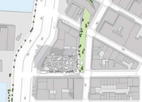
The site is located at the beginning of the High Line, at the intersection of Washington and Gansevoort Streets. Axis Mundi sought to ground the new building in a web of “historical axes” which form and organize the program. The plan is based on a series of sight lines extending to 10th Avenue, the Empire State Building, the Whitney on Madison, and the location of the original Whitney on West 10th Street.
Galleries Suspended in a Lattice
A desire for column-free galleries led the architects to create a perimeter superstructure to contain the staircases, escalators, elevators, and mechanical rooms. This structural lattice allows the galleries to float freely, suspended like bridges, unimpeded by a typical grid structure. The lattice allows light to flood the building in unexpected and dramatic ways, heightening the visitor’s perception of the artwork and the city.
Click above for larger image.
Intermingling Urban Fabric
Maintaining vitality at street level and reducing the distance between the street and the art itself was an important consideration for the designers at Axis Mundi. Instead of designing a large vacant lobby, an informal intermingling of public and private space occurs on the street level plinth, creating a complex folding of the urban fabric. The plinth is populated by large-scale sculptures, an outdoor cafe bridge, an info kiosk, and a performance area. A continuous path, weaving in and out of the lattice structure, leads the visitor from the entrance ramp at the corner of Washington and Gansevoort up to the panoramic viewing deck, overlooking the Hudson River and the High Line.
John Beckmann, principal of Axis Mundi stated “We imagine the contemporary museum to be a dynamic environment – a space that is less a container and more of a conduit.”
Click above for larger image.
Height: varies from 75 ft to 175 ft
Floors: 6 above (2 below)
Building Footprint: 39,000 square feet
Usable square footage: 195,000 square feet
Design Credits:
Design Team: John Beckmann, Andy Vann, Denise Pereira and Marielle Vargas
Renderings: Viviane Liao and Andy Vann
Illustrations + diagrams: Denise Pereira and Andy Vann



你上传的日志都好棒~喜欢 支持!