

Approaching to a concept design for a new brand is generally very challenging for designers. When in our daily work we cooperate with fashion brands which are already exist, we have to deal with their identity built in the market. So we definitely have to create a connection between our new ideas and the previous impression generated to customers without changing too much. On the opposite, designers do not have to deal with any background for building a completely new image for a brand which is soon to be launched in the market, but this may probably be a more difficult task. Then we have always to remember that the success of a brand will be influenced also from the image we are creating. So it is a more challenging task for designers.
为一个全新品牌设计概念形象对于我们 - 空间设计师来说是很具挑战性的。设计师的日常作业经常要与发展中的时装品牌合作,在此情况下我们需考虑品牌现有的标识。因为这样的品牌在客户心目中已建立了固定的印象,我们必需为这个印象和新的意念创造一个联系。另一方面,处理完全没有既定形象的全新品牌却可能是更艰巨的任务。我们反覆提醒自己一个品牌的成功很大程度上受我们设计的形象所影响。故此这对设计师来说又是另一种挑战。
The requirements from Alla Scala were really clear, as they knew their positioning in the market, having the experience of another successful brand as their background. The logo, which should become something really well-known among customers, is really wavy with a lot of shapes. That was the main inspiration and the starting point in the approach to the design.
拥有创造另一成功品牌经验的客户对品牌定位十分清晰,Alla Scala的目标要求非常明确。作为品牌第一标识的标志,充满曲线的图案给客户很深刻的印象。这个标志就是我们展开是次创作旅程的灵感泉源。
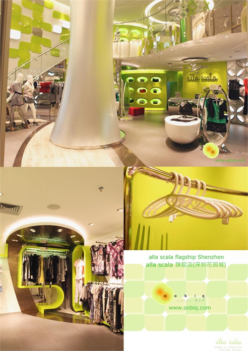
When we started to think about this project, we had in our mind the strong colors of the pop art, like the painting by Andy Warhol, and the furniture which has been directly influenced by that cultural atmosphere. The first idea was to cover also the side walls of the shop with wavy shapes that would have been the main topic of the image of Alla Scala. A sort of contemporary Pop image was born. Then these shapes became concentric ellipses – another reminder to the A and L letters of the logo - where every part is made of a different material or a different finishing. These shapes are not only on vertical or horizontal surfaces. There is not anymore distinction between them: the decoration goes on the vertical and horizontal surfaces indistinctly, there are no more borders. The main materials we decide to use in the ellipses are the warm wood together with the cold steel, to create a contrast. Then of course the main color of the brand image, the green, a young dynamic color that is going to be outstanding as even if so attractive that not many companies are using it in their brand image.
由接到客户的委托开始,我们首先想到用色大胆鲜明的波普艺术,如Andy Warhol(安迪沃霍尔)的经典画作和50年代的家具。首个概念以Alla Scala的重点曲线铺满墙面。当代波普形象就此诞生。继而这些曲线化身成同心椭圆,让人联想到品牌标志中的1和1,椭圆的层次是由不同的物料和饰面所组成。这些椭圆并非单独出现在一个垂直面或水平面上。垂直面和水平面之间再看不出边界:椭圆装饰在垂直面和水平面中游走。椭圆装饰的主建材以温暖的木材配搭冰冷的不锈钢形成强烈的反差。品牌主色挑选了年青活力,出众抢眼,兼很少品牌在用的绿。
All the items in the concept are designed according to the idea of the wavy shapes. All the free standing displays, for example, are designed according to a L-shape that create an organic design all around the shop. The walls of the shop are treated with green surfaces of different finishing that can create a very dynamic and constantly changing space. Main shelves will be in a neutral white, so that products will be even more outstanding, or in stainless steel, with smaller sections and size. The middle hall in the bigger showroom will be used as an eye-catching focus area. An organic sculpture, covered with a shiny silver color, will be designed as a natural cave in the middle of the shop. Outside it will be also a space for hanging products, while in the middle there will be one or more manikins, as a precious island, hidden from the main part of the customers. The basic idea of the concept was to create an environment where customers can feel comfortable, where the round shapes will give an idea of warmly embracing people. All the details are designed according to the same concept, in order to create a brand which is outstanding and unique on the market.
概念内的所有物件设计均由曲线展开。如中岛陈列,就是按照小草升所设计,有机图案不断贯穿整店。店内墙面以不同的绿色饰面创造出一个层次感丰富的动态空间。天然纯白的主货架和不锈钢次货架让本身质优的产品显得更亮眼。商场店的中厅将成为最吸引眼球的焦点。闪亮耀目的银面有机大造形在中厅创造出天然的洞。大造形外围设有挂产品的空间,充满神秘感的洞内同时可放置多于一个模特或产品组合。整个概念设计的重点在于四周的弧形曲线创造出客人被拥抱的舒服感觉。所有细节均沿用同一个概念,为这个品牌建立一个概念完整,非凡出众及独一无二的形象。


所有评论