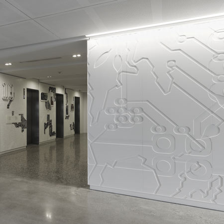
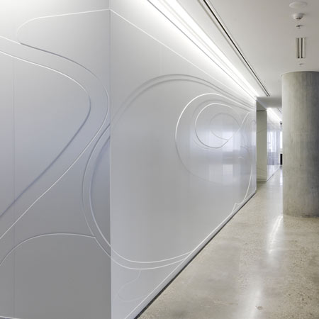
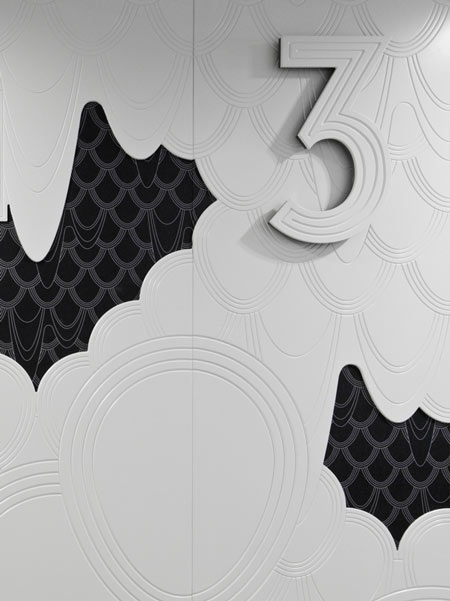
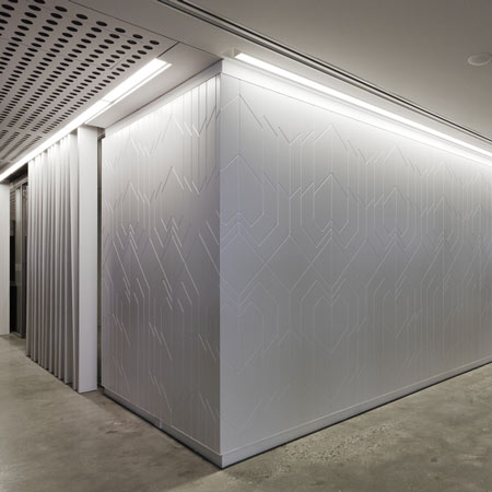
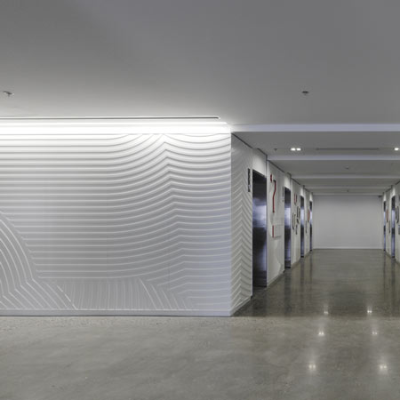
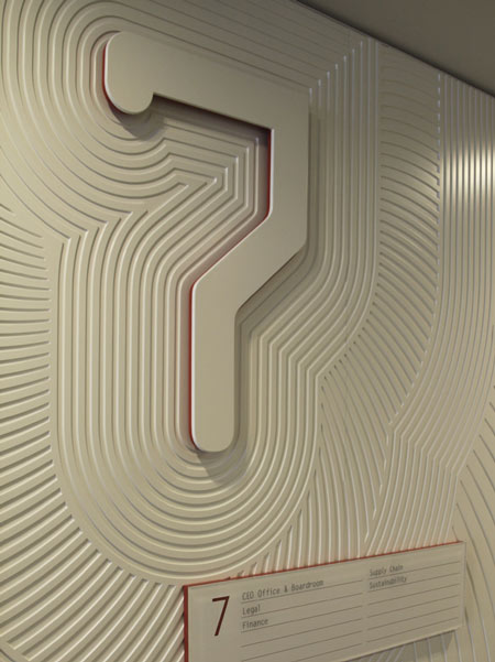
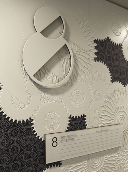
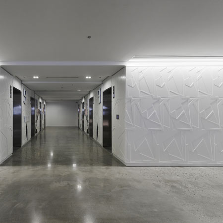
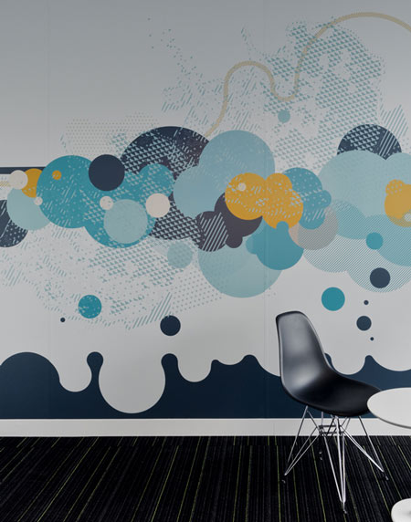
Australian designers Büro North have completed the graphics and signage for the head office of Australian department store MYER, featuring patterns carved into the walls.
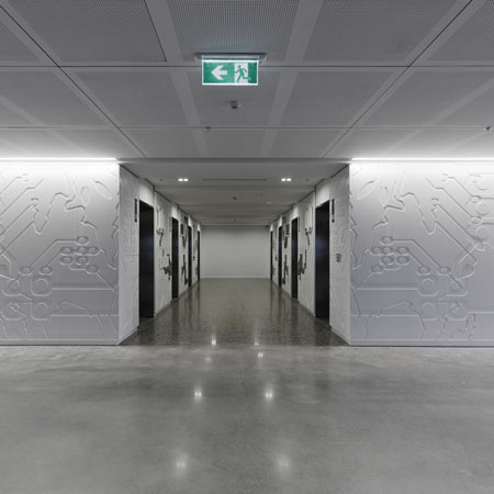
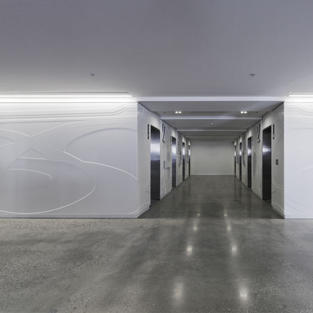
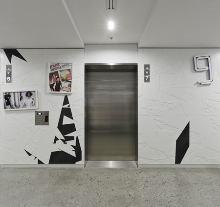
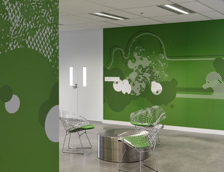
The design on each floor represents a specific decade in twentieth century fashion, starting from 1910 through to 1990.
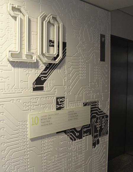
The signage was designed using materials relevant to the decade represented in each space.
More about Buro North on Dezeen:
Solar Shade by Buro North (May 2008)
Eco Christmas tree by Buro North (December 2007)
Here’s some more information from the designers:
MYER, Australia’s largest department store recently relocated their head office. BVN Architects commissioned Büro North to design graphic embellishments and signage throughout the space.
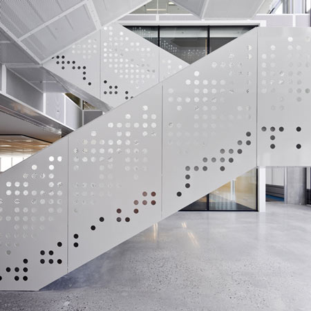
After a thorough research phase, we crafted design which evolves throughout the nine floors.
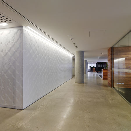
Each floor is themed by a specific decade in twentieth century fashion, starting with the 1910’s and working up through the building to the 1990’s.
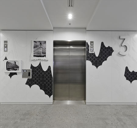
Wall Graphics were relief routered and signage developed using a feature material relevant to the decade.
Toilet pictograms were given the same decade relevant treatment creating a subtle and sophisticated interpretation of MYER’s heritage.


所有评论