
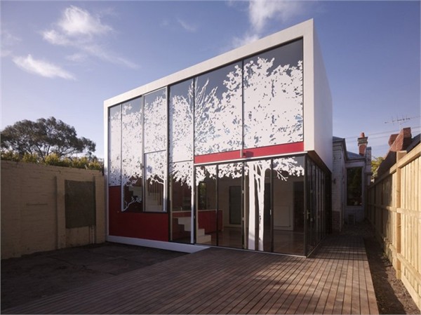
The tight budget generated many of the design decisions. The form is a simple box- the strongest form an architect can achieve at a bargain basement price. 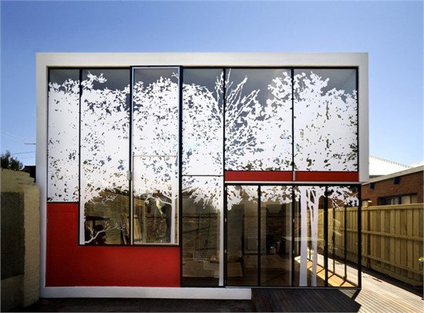
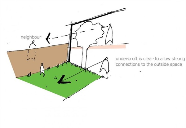
From the starting point of the simple box we began to express the addition as a covered external space. The original house is very internalised. The extension was to be as open as possible so that when one crosses the threshold between the original and new structures they felt as though they were entering a covered deck rather than additional internalised space.
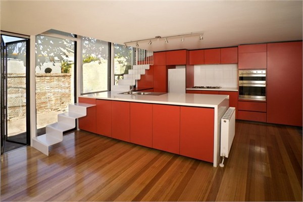
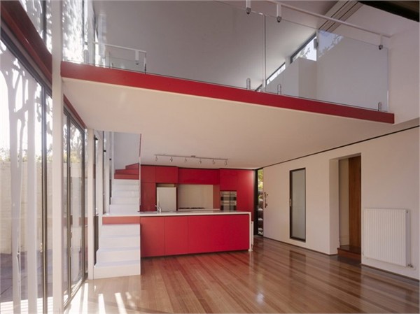
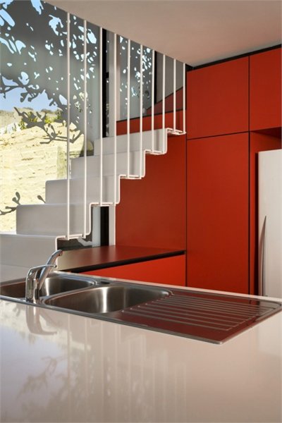
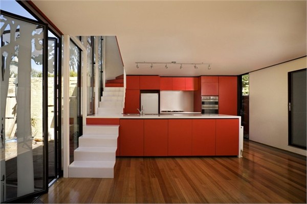
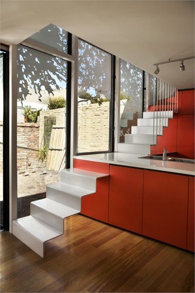
Generally we try to avoid having separate ideas performing different functions. We try to be economic with our concepts and make a couple of key ideas achieve multiple and varied tasks. Every element within the Tattoo House needed to perform multiple functions for maximum return- hence the kitchen bench becomes part of the stair, and the screening required by council reflects heat and glare away from the expansive windows.
Despite these challenges a double story, non-domestic scale space was achieved with a basic palette of materials.
Wrapping
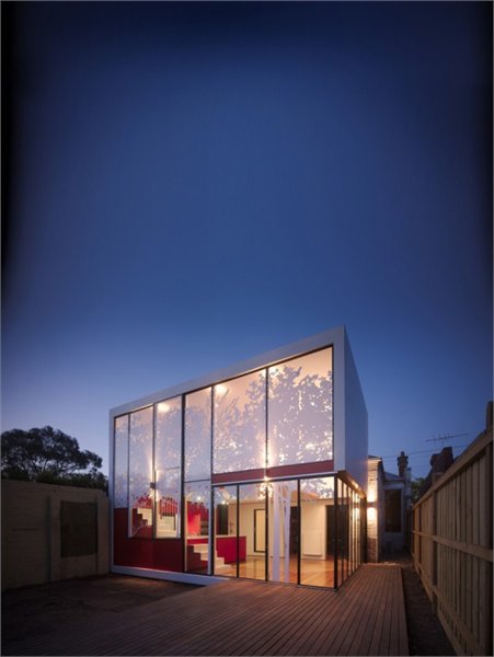
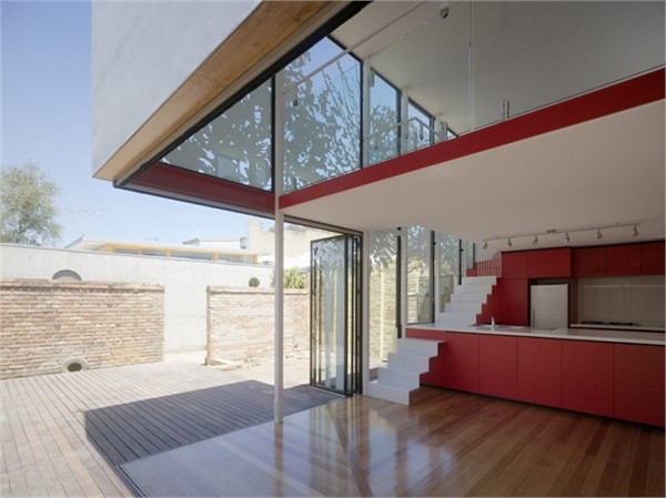
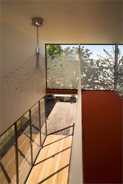
The new architecture was approached as no more than a deck. Through bringing the external decking up to the original back wall of the home, then turning and folding it where existing structures were encountered, a covered open backyard was effectively created. The detailing of the decking timbers reveals the wrapping pattern further.
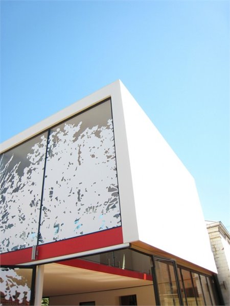
Bi-fold doors retreat to reveal a completely open corner, framed by the box while allowing uninterrupted flow between the extension and the backyard underneath, merging these spaces while retaining the edge of each. The folding doors and post-less corner make the form of the structure appear precarious. The structure playfully feels as though it defies gravity and may topple.
Screening
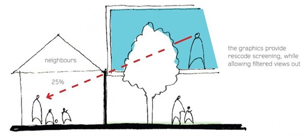
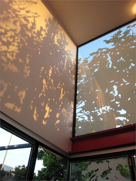
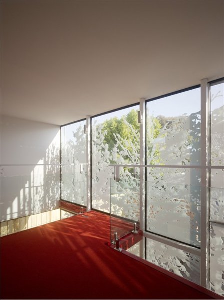
The stickers became a multi-purpose solution to the dual requirements of council overlooking regulations and glare reduction.Legislation which dictates a 75% opacity to second-storey windows was resolved with UV stable stickers rather than expensive and elaborate screening. The tree supergraphic creates playful and ever-changing shadows across the interior spaces and is composed of images taken in the local park.
Tattoo
The tattoo was conceived as a continuation of the tree graphic around the simple white box- to soften the impact of this modern addition to a resolutely 19th-century neighbourhood. Furthermore the design was a neighbourly gesture. The household to the west has a manicured garden which is very important to the resident. A stencil of vegetation was created in-house and applied by the AMA team in a covet operation to give the neighbour an additional, though less than manicured, layer of garden.



那树影应该很不错的·~嘻嘻