
“空白处并非真空,乃灵气往来生命流动之处。且空而后能简,简而练,则理趣横溢,而脱略形迹”。
"the blank doesn't mean empty, it's for anima and life flow, result in concise then to refinement full of philosophic flavor , finally get rid of the shape restriction."
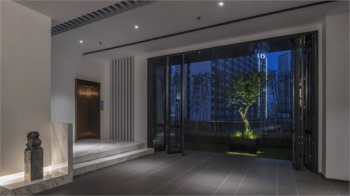
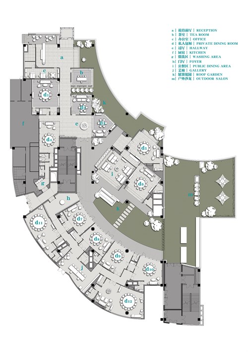
隐江澜项目拥有部分可塑性较强的露台的空间优势,所以在空间规划的最初考量上,我们便试图将室内空间与屋顶花园形成联结和对话的关系,并且设置若干个景观焦点,来提升室内外场域之间的融合度。
There is a space advantage for Yin restaurant who own a terrace for flexible design, so we tried to build a connection and interaction between interior space and roof garden at the beginning of space plan, quite a few scenery highlights are also applied to improve their fusion degree.
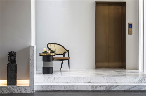
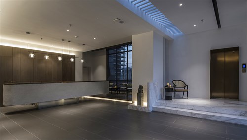
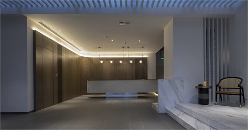
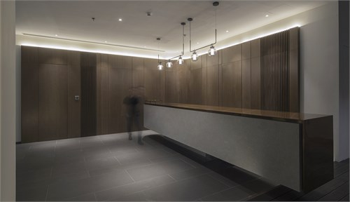
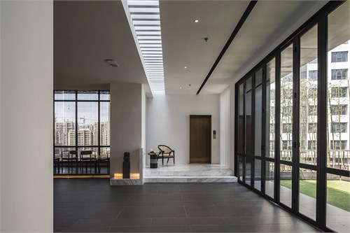
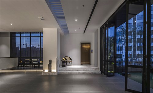
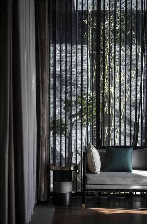
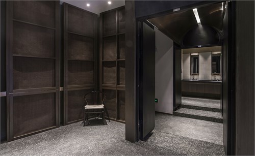
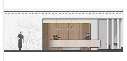
一部专属电梯过滤掉外界的喧嚣后步入这个桃花源。甫一出轿厢,便可看见过道和接待区被透过顶面隔栅所引入的日光进行了空间切割。随春来秋往产生的光影变幻呈现在深色的素净地面上。接待区木饰面背景与庭院中石榴树形成对景,室内与自然相融,时光与风光与共;过道经过刻意纵向的拉伸后更释放出一种通幽感,形成动静并序的过渡空间。
A exclusive lift will filter exterior noises and bring you into this peach garden. Just out of the lift car, your eye sight will run into the corridor and reception area, which are naturally divided by day lighting penetrating from the roof grating, they play a light and shadow shift along season changes and cast a dramatic effect on the dark but plain floor;
The timber finish background in reception and the pomegranates in garden form a vision contrast, the interior extended into nature, time blended into scenery, a sense of deep and serene created by the longitudinally stretched hallway, which also become the transition space of movement and stillness.
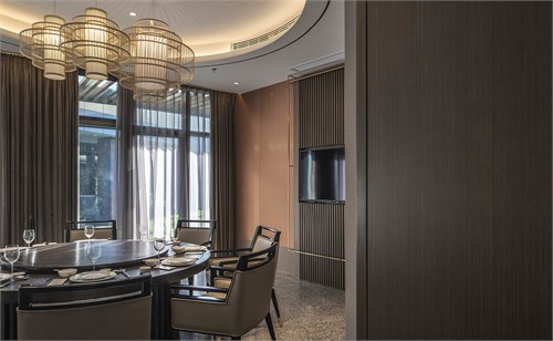
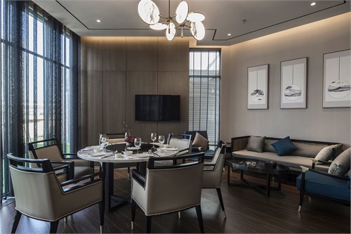
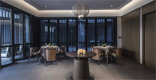
穿过曲径移步到庭院更深处,可见中庭景观被围合于包厢中间,我们取徽派建筑中“四水归堂”之意,每间包厢的视觉汇聚点都相交在内庭院的水景位置,“以水为镜,照苍穹之蔚”,风和景随光线融入每一间包厢,食客们在此间可听风可看雨,可觥筹交错。
Across the winding path into the court yard core, there are PDRs surrounding the central water feature, it converges sights from all directions, this is inspired by the concept of Hui style architecture -"Four waters return to the hall", which regards the water as a mirror reflecting the vault of heaven, merging the scenery into each PDR with lighting, bringing the guests music of wind and rain, cheers of toasting.
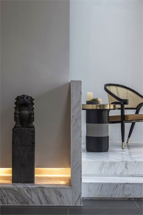
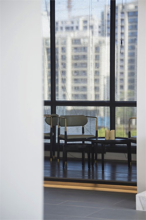
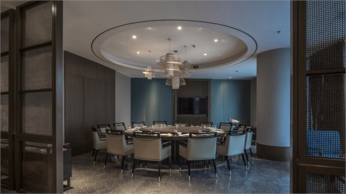
用餐空间大块面木质元素及暖灰色墙纸搭配加深了整体调性,低饱和度的丝质硬包背景的运用,则以平衡空间分量感,在暗沉低调中跳脱出透气及精致;屏风细节中藤编与黄铜的质感对比,则试图在东方禅韵与当代简约之间探寻到更适合的空间形态体验点。公共区域的整体处理上,我们则用了更多留白的手法以及大的体块关系,以期用无相表达意向。
The dining space use wide timber elements to match warm-grey wall covering, helping improve the overall harmony; the silk hard packing in low saturation balances the spatial feeling; The boutique and fresh feeling jump out of the dark color tone; the weaved ivy and bronze together to create a sense of contrast; all these details try to reach a best experience point between oriental Zen spirit and contemporary concise.
The public area is holistically dealt with more blank and creates large volume relationship, a way to express intention with rich imagination.


所有评论