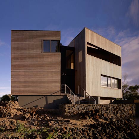
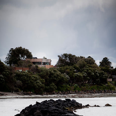
This wood-clad house perched on rocky terrain in Victoria, Australia, was designed by Australian practice Farnan Findlay Architects and features two separate volumes joined by a central walkway.
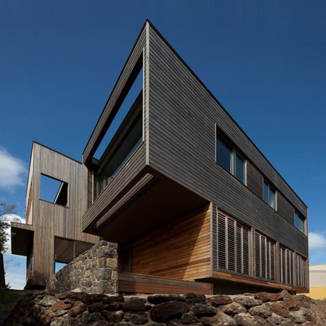
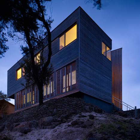
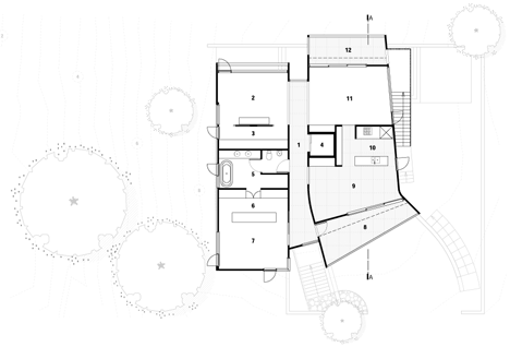
Called Port Fairy House 2, the building has bedrooms and bathrooms hidden behind wooden screens on the ground floor, with the more public areas featuring large windows and terraces.
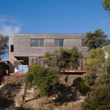
Curculation inside is by elevator, while an external staircase wraps round the building connecting all levels.
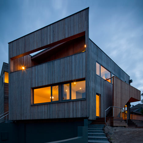
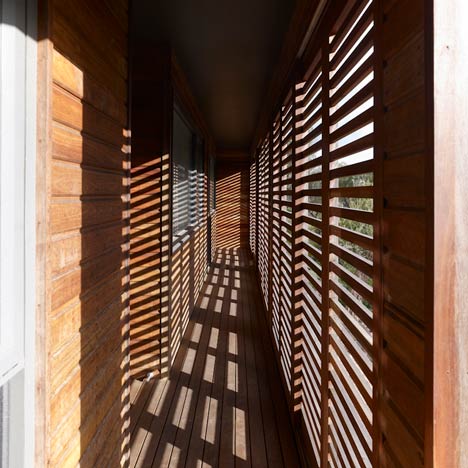
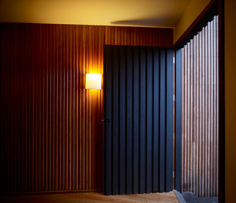
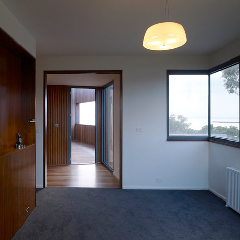
The wood panelling of the exterior extends to the internal corridor.
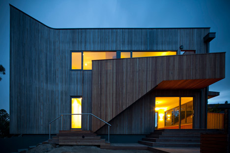
Photographs are by Brett Boardman.
More residential architecture on Dezeen »
The following information is from the architects:
Port Fairy House 2
Battery Lane, Port Fairy, Victoria
Completed 2010
“Nestled among the tea-trees with commanding views over the Moyne River mouth and Bass Strait, Farnan Findlay have created this highly crafted and sustainable family house split into two architecturally expressed zones – the AM ‘daylight’ and PM ‘after-dark’ zone.”.
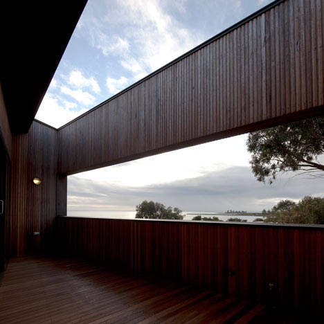
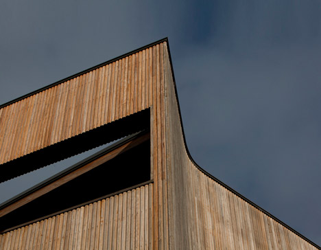
The idea of a ‘public and private’ division of spaces drives the form of this project, manifested in a 2-part form when read externally. Less than 50m from the water, a plinth emerges from its stone setting to create a platform for the structure above that bustles with cantilevers and twisting that evokes an escaping form.
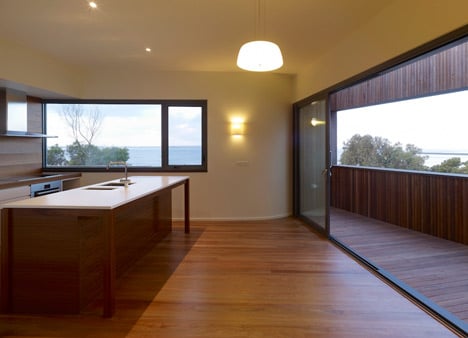
The house is oriented around the competing interests of solar access on one side and the ocean views on the other. Framing desirable views and excluding awareness of neighbouring dwellings has been an important aim in the design and influenced the positioning of external openings to create the client’s sanctuary. Internally, the reading of the two external forms continues as the external materials seemingly flow into the internal ’street’, making you aware when moving from one form to another.
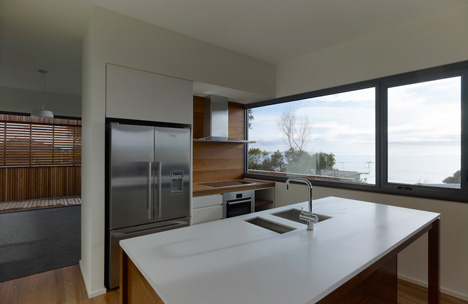
Built with durable materials that will fade into a soft grey when aged, the house will gradually become one with its rocky outcrop and the natural tea-tree backdrop, whilst its glazing reflects and multiplies the ever changing moods of the ocean and sky.
Architectural Programme:
Designed 4 years ago the evolution of ideas from our previous work is evident. Taking our cue from the unpredictable weather which is temperate but prone to chilly winds despite sunshine, we further explore the idea of ‘external rooms’. We use this term for spaces positioned within the main volume of the building.
Spaces with peeled back layers of walls and roof to reveal views & sunlight, whilst delivering needed shading, shelter from the winds as well as privacy screening from cross-viewing.
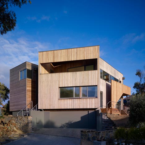
To be able to create the sharply expressed volumes, we minimised disturbances of the building’s continuous ’surfaces’. Reducing the glazing and introducing clearly defined openings allowed us to achieve a balanced homogeneous façade which assist us in moderating the climate at the same time as framing the desirable views.
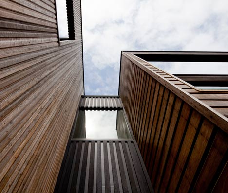
From the outset, we were interested in how our work intersects with the sky and whilst the rectilinear forms belie such an approach, the combination of height and extent of those forms against the skyline create a constantly changing interaction.
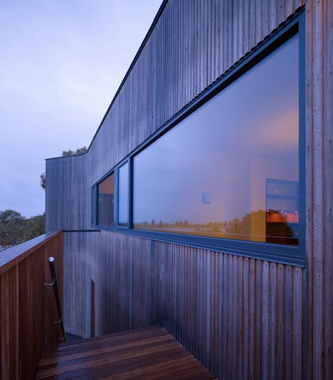
The external form was developed from the idea of 2 living quarters. One is a reclusive and private refuge with hidden bedrooms protected by movable external screening or securely located on the upper level. The other is a far more outgoing and expressive volume punctuated by openings and external spaces.
Its building axis shifts and curves towards the sea to create internally a telescopic effect that funnels the ocean views straight into the living quarters. This external readability of the form is our response to an otherwise potential bulky floor plan as well as a response to the site’s available views and orientation. A subtle change in texture in the cladding as well as a recessive link reinforces this architectural language.
Circulation
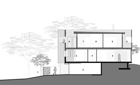
We initially grappled to understand the client’s desire to rely completely on a lift for circulation between the floors but the addition of an external stair put everyone’s mind at rest.
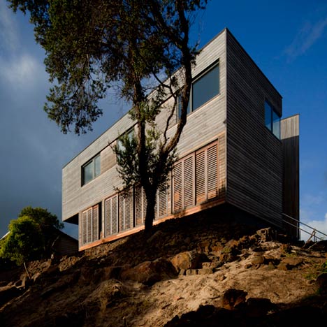
In situations where the living area is located above ground it seems critical to us to allow for direct access tp and from the site around the house.
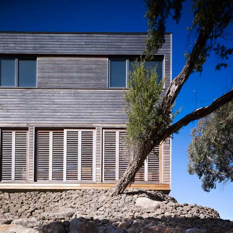
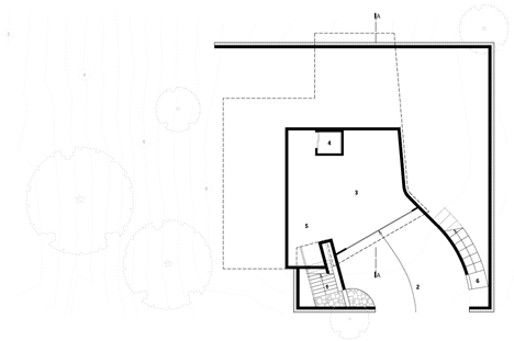
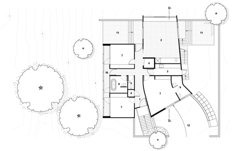
Removal of the internal staircase liberated the floor plan and allowed us to better achieve the client’s intensive brief. The main circulation in the floor plane is a central hallway between the two built forms. From this point the axis of the building is clear and the external finishes are read internally to reinforce the programme.
Materials
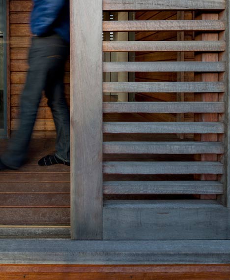
Generally, we believe in materials with texture and natural beauty which stand the test of time and bear out the craftsmanship of the construction.
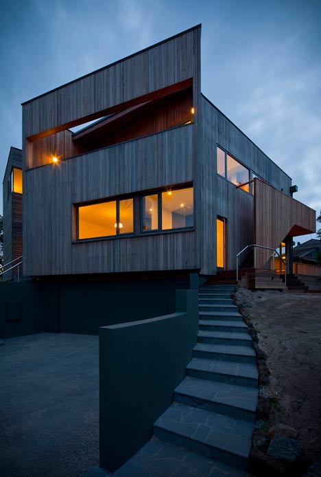
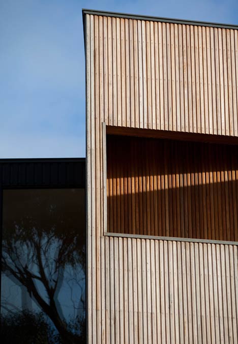
The building is clad in Spotted Gum which is oiled and allowed to grey off so it takes on some of the colour and texture of the natural Tea-Tree setting. Double glazed windows are commercial aluminium.
The haggard foliage is in stark contrast with the rectilinear outline of the house and brings the natural beauty of the site into a sharper focus. Evidence of volcanic action in the area are seen everywhere.
Basalt us the language of the historic structures in the nearby main township and is used in the base course walls and landscape elements that reach up out of the site to meet the structure. Volcanic boulders are used throughout the landscaping.
As the site’s landscaping grows up and around the building it will restore the natural site around the new construction, thus further isolating the building from its neighbours and embracing it in belt of greenery.
Click for larger image
Brief
The client approached us after seeing a previous project of ours on the adjacent plot (Port Fairy House 1). We were asked to create a structure that took advantage of the exceptional ocean views towards the south and east of the site.
Click for larger image
The new home had to allow for ample amenities for visiting family whilst maintaining the client’s privacy as well as to cater for possible future needs in regards to accessibility.
Click for larger image
In the meantime, the architectural context was further enhanced as Clinton Murray/Shelley Penn had completed a house on a neighbouring plot. Our intimate knowledge of the site from the previous project enabled a considered response to the brief.
Click for larger image


所有评论