Graphic designers Multistorey have designed the interior, exterior and branding for a homeware shop on Portobello road in London.
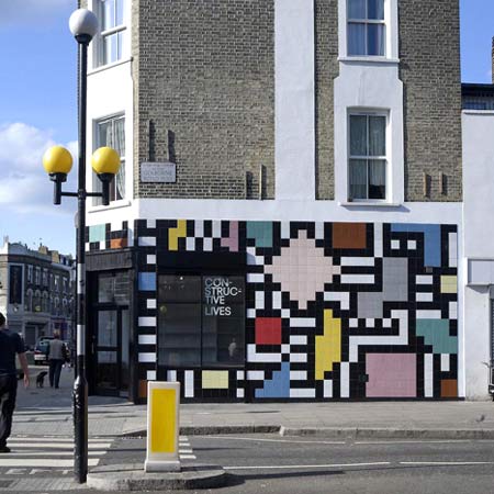
The designers decided to cover the exterior with brightly-coloured tiles, which informed the graphic products, branding and website for the store.
The project was completed in September last year.
Here are some more details from the designers:
–
We have designed the first in a new chain of shops in London that will sell furniture and accessories for the home. Initially approached to design just the branding element, we proposed to the owners that we take on the entire art direction of the shop including the interior design and fit-out, the external cladding and all the printed and screen based requirements [carrier bags, website, stationery etc].
Our concept was led very much by the shop’s location on Portobello road – an area with a diverse cultural community and strong and vibrant visual identity, the shop premises which had a large external wall, and the owners mixed African, Irish and West Indian heritage.
We wanted to make the exterior of the shop very high impact so that it would stand out yet feel at home on what is a visually busy street. Whilst researching African and West Indian patterns and decorative arts, we discovered the geometric wall murals of the Ndebele community of South Africa which were simple, striking and painted in the most beautiful colours.
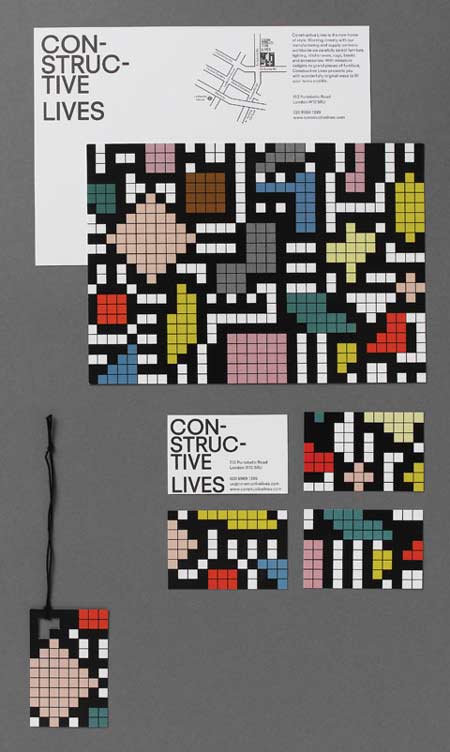
We liked the cultural origins of these murals being hand painted by the womenfolk of the tribe to assert their individuality in a strictly patriarchal society. Taking these as a starting point we created our own version in a contemporary ceramic tiled permutation for the large exterior wall of the shop.
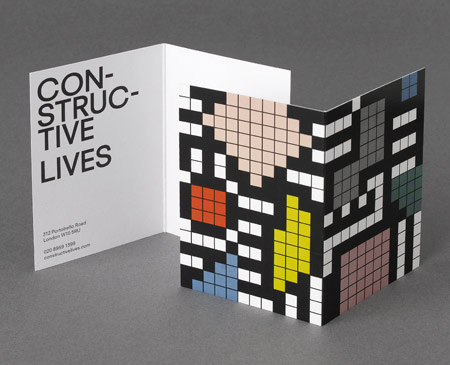
In breaking up the shapes to a bitmapped tile version, they began to take on a whole new life of their own, even resembling and playing off the large zebra crossing and street lighting directly outside the shop.
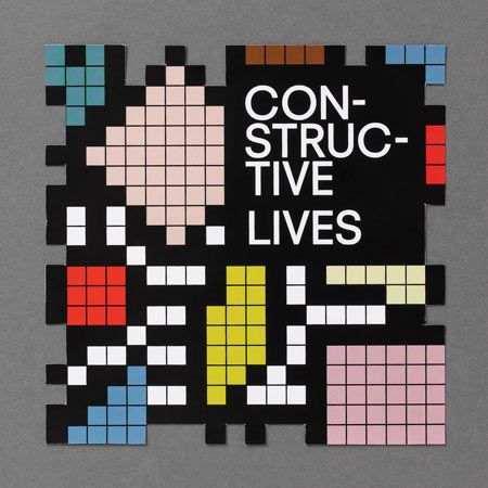
With the pattern itself being so striking, the typographic element of the branding needed to be quite simple and utilitarian so as not to clash. We applied the typographic sign to the windows of the shop — giving them space to breathe, away from the pattern.
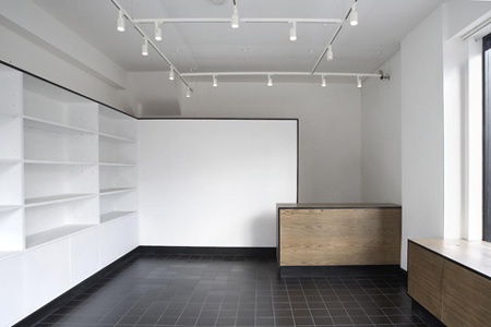
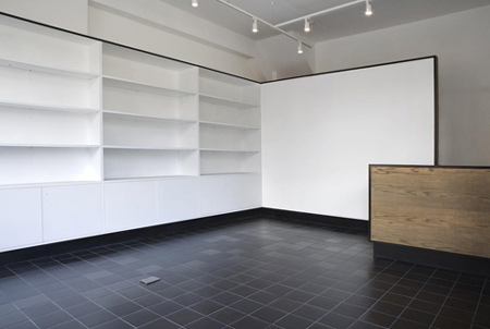
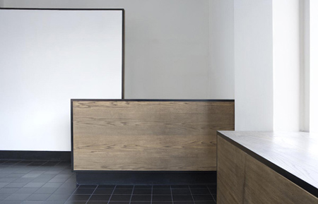
For the interior of the shop space, we felt that a pared down palette would be more functional for the display of products, but continued the tiled element inside with a black ceramic tiled floor. Four built-in units of window display plinths, cash desk and shelves were constructed from wood or white painted MDF, and each piece finished with a black frame giving a structured, geometric yet warm feel to the space. The sun casts shadows of the shop’s name into the shop, which create ever changing typography on the units.
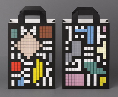
For the carrier bags, stationery and website, we have used the tiled pattern as a decorative device, with the aim of the tiled pattern becoming a key part of the brand recognition.


不错