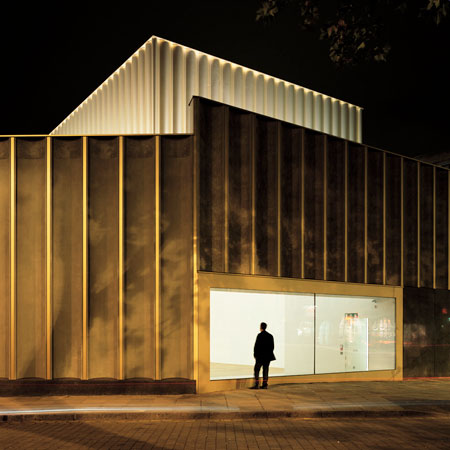
London practice Caruso St John Architects have completed an art centre in Nottingham, UK.
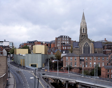
Called Nottingham Contemporary, the project is inspired by artists’ spaces in down-town New York during the 1960s.
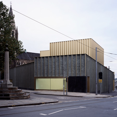
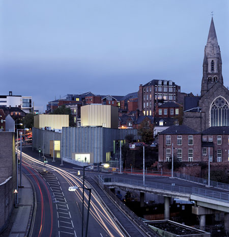
Located in the Lace Market area of the city, the design aimed to recreate the feeling of found spaces in a new building.
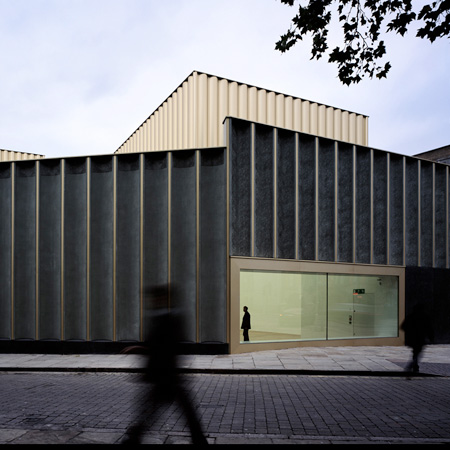
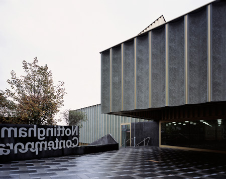
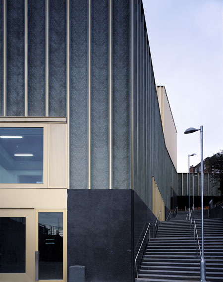
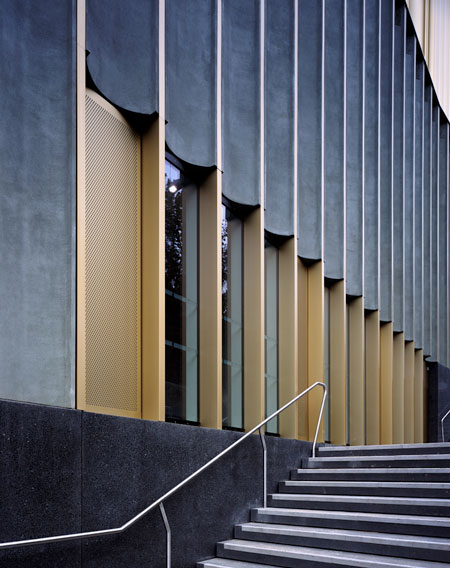
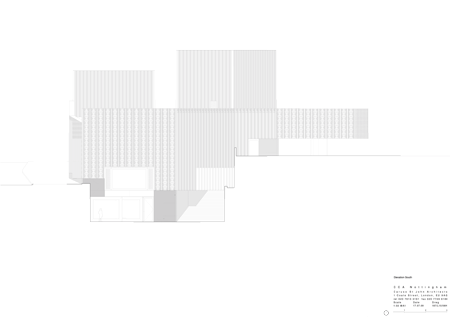
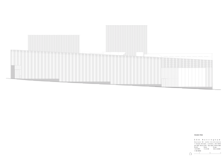
The facade is clad in lace-patterned, pre-cast concrete, inspired by the regular and repeated surfaces of the surrounding warehouses.
Two blocks on the roof are covered in fluted gold anodised aluminium.
The centre opened to the public on Saturday.
Photographs are by Hélène Binet.
Here’s some more information from the architects:
–
Nottingham Contemporary
Nottingham has a history as a place for contemporary art, for performance and time based practice as well as for object based work. This legacy recalls the artist run spaces of downtown New York in the late 1960s, and the work of artists like Gordon Matta Clark and Trisha Brown whose work directly engaged the spaces of the city around them. The legacy of the downtown loft lives on in places like PS 1 in New York, Palais de Tokyo in Paris, and the De Pont Foundation in Tilburg, buildings whose artistic programmes fully exploit the strong and specific character of their found interiors. Our project for Nottingham Contemporary sets out to offer a wide inventory of interiors that have the variety and specificity of found spaces, within a new building.
We wondered if the history and urban qualities of the site in Nottingham’s Lace Market, which has parallels to the cast iron district of downtown New York, offered an opportunity to make art spaces that were unusually engaged with the cultural and topographical qualities of their site. The design engages with the major levels of a very complex site. An existing north-south public route through the site has been given a renewed purpose by its adjacency to this new public building. At High Pavement, to the north of the site, a covered yard provides a generous outdoor space at the entrance to the building, and a starting point for this public route. Garner’s Hill stairs have been straightened and made more than 5 metres wide, and the route southwards affords views and access to each of the levels of the interior.
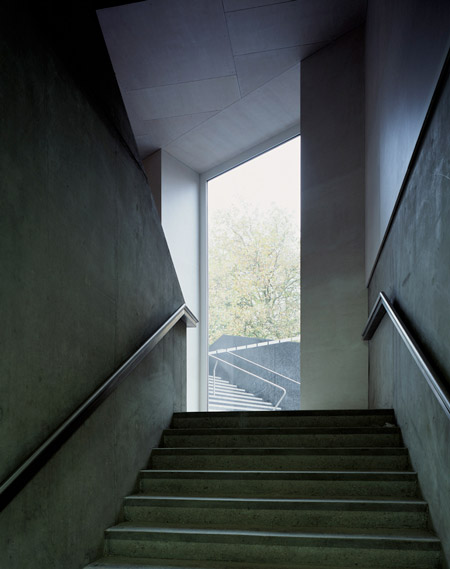
The route culminates in a second public yard at the southern end of the building, a space where the café can spill outdoors and which provides a second entrance to the building from the south. A last flight of the stair completes the route to Cliff Road where vehicular access, loading facilities, workshops and plant are located. The close relationship between the interior of the building and the topography of the land means that the character of Nottingham Contemporary has fundamentally emerged from the specific qualities of its site.
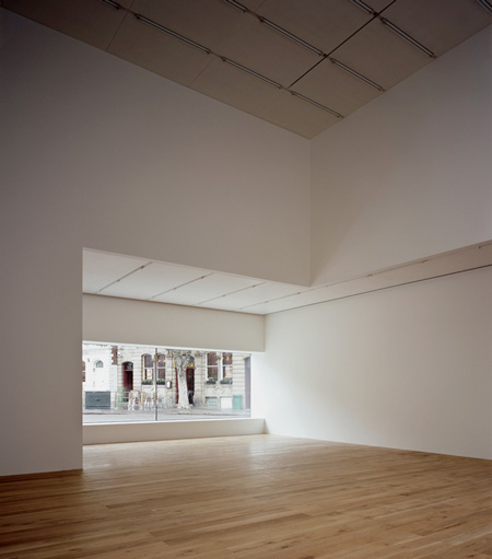
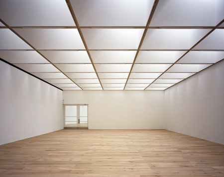
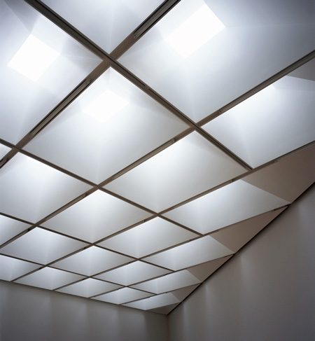
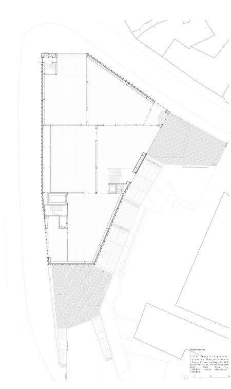
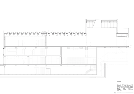
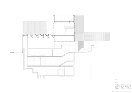
The main entrance to the building is from Upper Yard. A large canopy, like a cinema marquee marks the point of entry, and even before entering, one can see art within the depth of the building. Passing through glazed entrance doors one enters into the first in a network of five rooms. The ground floor galleries have a 4.5 metre clear height and even top lighting that is moderated by a grid of lightweight coffers that are suspended within the steel roof structure.
The galleries are defined by thin, non load bearing walls, and are connected by large glazed openings that afford views across the width and length of the floor and which lend flexibility to how this suite of rooms can be used. The northern most gallery is 10 metres high and has a single large roof light and a 9 metre wide window facing Weekday Cross and beyond towards the centre of Nottingham.
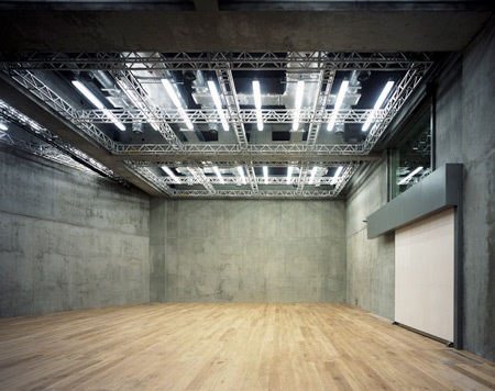
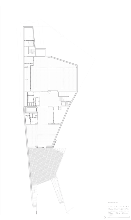
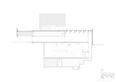
The lower exhibition space is a large, lozenge shaped room, 7.5 metres high and formed in concrete. One can feel that this room is built deep into the sandstone cliff. The 1.5 metre depth of the concrete beams that span the space accommodate a fully flexible theatrical rig. Retractable bleacher seating enables the space to be used for cinema and performance as well as for visual art. To the south is the café and bar that can be independently entered from Lower Yard. In the middle of the building a mezzanine level accommodates education and office spaces.
Ground Floor Plan
Click for larger image
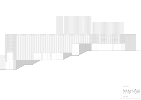
We were interested in the presence of the cliff and the way that it elevates the southern edge of the Lace Market so that several ranges of buildings are presented, almost in elevation, to the south of the city. While the line of the cliff is reinforced by the low slung body of the building, the profile of Nottingham Contemporary is distinctive and becomes a part of the spectacular view from the south, where the buildings of the Lace Market form a crown against the sky. The roof volumes build up in size towards High Pavement and have a clear relationship to the volume and scale of the existing Georgian townhouses that line the southern edge of the Lace Market.
Basement Floor Plan
Click for larger image
The exterior image for Nottingham Contemporary is inspired by the 19th century buildings of Nottingham and in particular by the impressive facades of the Lace Market, where hard brick forms a robust shell to the repetitive structural frames of the warehouse buildings. The toughness of these facades was originally about durability and low maintenance but the rigour of their repetitive pattern and precise material assembly also lend a dignity to the streets of the quarter.
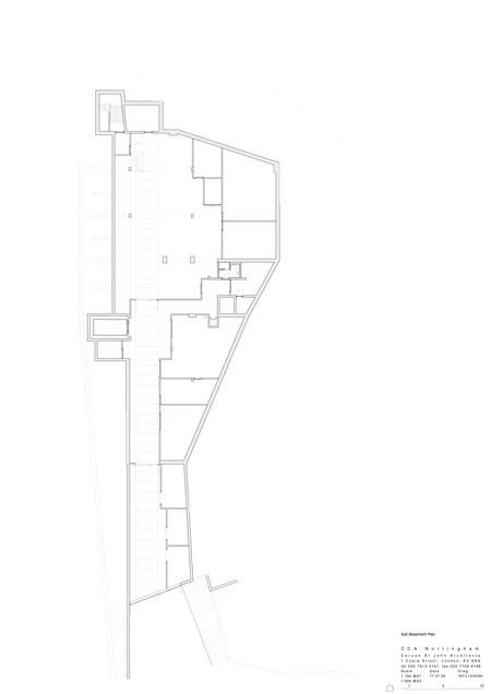
Sub-Basement Plan
Click for larger image
The facades of Nottingham Contemporary are developed as a continuous patterned surface of pale green pre-cast concrete elements. Terracotta facades by Louis Sullivan, in particular the Guarantee Building (1896) in Buffalo, have served as a model for our façades. Sullivan’s finely moulded surfaces with their rich and considered use of pattern speaks of their material and fabrication as well as being incredibly beautiful. Something of these qualities can be achieved with contemporary techniques of casting concrete, without the intensive use of skilled labour that was required in the production of 19th century terracotta.
Click for larger image
The cast pattern is taken from a specific example of Nottingham lace, which itself was a machine made copy of a French hand made original. The lace was scanned, and then the scale, tiling and contrast of the two dimensional image was worked. This modified image was then converted into a three dimensional description which was used to drive a milling machine that produced a full sized positive in MDF which was then used to make hard latex moulds. Four, 14 metre long latex moulds were used to cast all of the pre-cast elements on the building.
Click for larger image
The two rooftop monitors, figures that give Nottingham Contemporary its silhouette within city’s skyline are clad in tall sheets of gold anodised aluminium which have been given a gently billowing profile that serves to stiffen the very thin material.
Click for larger image
A major exhibition of over 60 works by David Hockney from museum collections across the world will open the new building. The exhibition will re-examine Hockney’s work 1960-1968 in the context of art today. It is the first time the early work – finishing with the iconic Californian painting A Bigger Splash – has been brought together since the Whitechapel retrospective of 1970, nearly 40 years ago.
Click for larger image
Also on show for the opening of Nottingham Contemporary will be a retrospective exhibition by American artist Frances Stark, a resident of Hockney’s Los Angeles. This is her first solo exhibition in a British public gallery. The show includes some work specially made for the Nottingham Contemporary exhibition.
Click for larger image
2004–2009
Location: Nottingham, UK
Client: Nottingham City Council
Project Status: Built
Click for larger image


所有评论