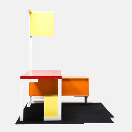
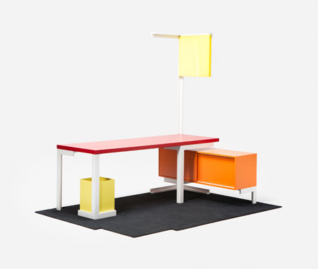
French designer Matali Crasset has designed an integrated desk, cupboard, lamp, rubbish bin and rug for Established & Sons.
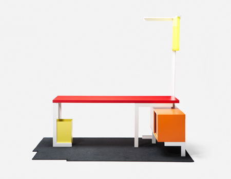
Described as a “room within a room”, Open Room No. 1 explores how to define architectural space with furniture.
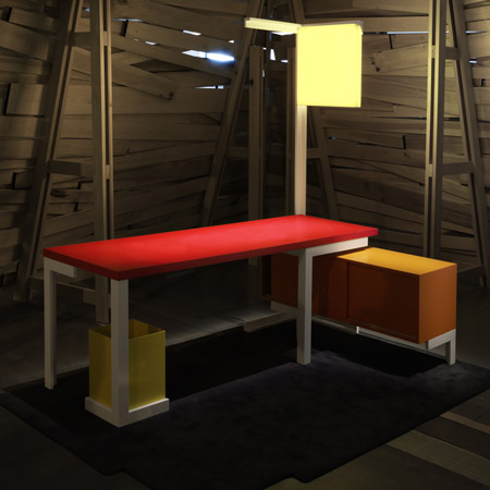
Established & Sons showed Open Room No. 1 in Milan in April but photos have only just been released. See all Dezeen’s Milan 2009 coverage in our special category.
See links to more Dezeen stories about Matali Crasset here.
Here’s some text from Established & Sons and Matali Crasset:
–
Matali Crasset’s new work is an exploration of space. Spatial dynamics that is. The Open Room No.1 is a design with architectural ambitions. It is an object and ‘space’ at the same time: a room within a room.
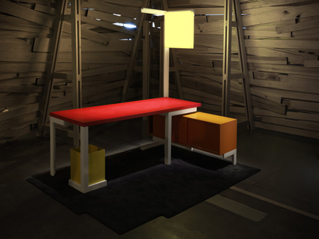
‘With Open Room No.1 I wanted to go beyond furniture. It is much more than that. It’s a space, a platform that can be the base for a script of life’ (the scenario de vie is at the heart of Crasset’s design philosophy). The piece can be described as a room that fits into an existing room. There are no walls, but Open Room No.1 does have clear boundaries. These are formed by the angles of a steel structure linking a brightly coloured table, cupboard, lamp and small container. ‘It is an open structure. But at the same time, you feel as if you’re inside of something — the object becomes space.’
The object is space, but it is also a tool. It is meant to be used, not just looked at. This goes far in explaining the simplicity of both the design and the materials; ‘We’ve picked the materials for what they do, not what they stand for. I didn’t want to do an exercise. You can’t live with an exercise. The idea was to do something that’s lasting and timeless. I didn’t want to associate the object with a particular aesthetic. You have this whole school of design with a strong, imposing identity. For me, the look of a piece should be the result of an intention, and not the other way round.’
Some words from Matali:
My furniture has always focused on space and activities. For Established & Son I propose more than a desk, storage cabinet, side table … but an empty platform area adaptable to various scenarios.
It is a space with no walls, no restrictions – just a supporting contour remains. It is both a symbolic and functional object made with defined corners delineating space.
A stage just waiting to come alive.
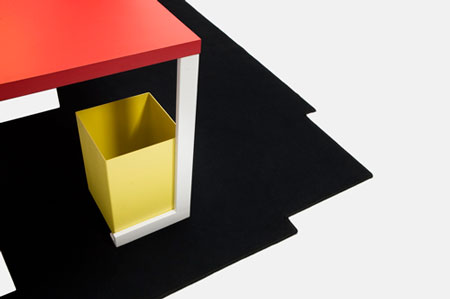
A space perfect in itself, an interconnected object including a work table, storage space, a light and a small rubbish bin. A space created for activity, feeling indoors but being totally visible to others and the world which continues its voyage turning around us …
Easy to understand: a metallic technical design cut by angles and lively coloured functional props where life adventures are organized.
A furnished space but free from traditional definitions, emphasizing simplicity and immutability.


所有评论