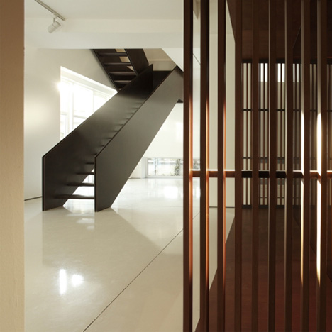
Architects Teka Studio have converted an old tannery store house in Bergamo, Italy into a family home.
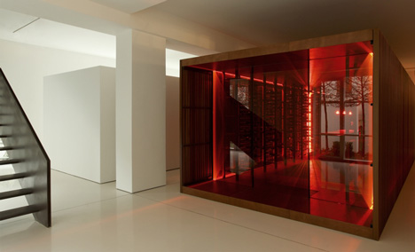
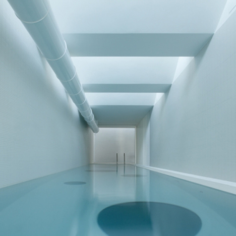
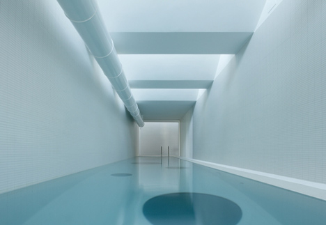
The three-storey building now features a free-standing wine cellar on the ground floor (above) and an indoor swimming pool on the top floor (below).
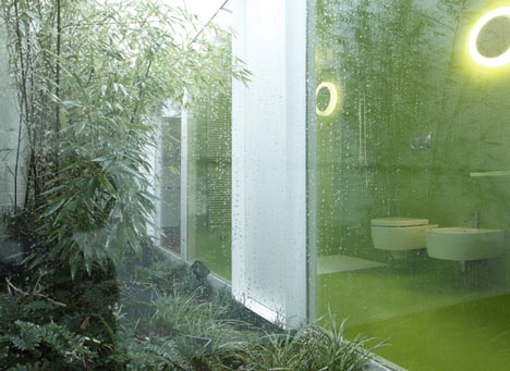
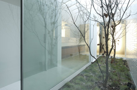
The bathroom is located on the ground floor and looks out, through a glazed wall, onto a little courtyard.
The living spaces are on the first floor.
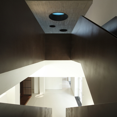
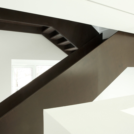
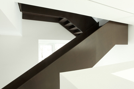
A corten steel staircase links the ground and first floors.
Photographs are by Luca Santiago Mora.
Here’s some more information about the project:
“Interior Day” renovation of a productive area
Space
Simple volumes of different shapes placed on top of one another and linked in such a way as to create a subtle effect of interconnections, amid itineraries of light, recurrent geometries and points of emphasis.
This interior design was conceived for a three-storey building, formerly the storerooms of an old tannery in the north-east of Bergamo, to be converted into a home, characterized by the presence of industrial activity which has now been completely abandoned.
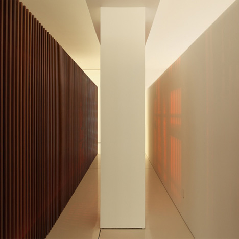
On the ground floor, the square floor plan was divided by concrete pillars into three bays of different widths. The service rooms are located here and defined by elements of a lower height with respect to the area accommodating them, to reveal the industrial character of the pre-existing space.
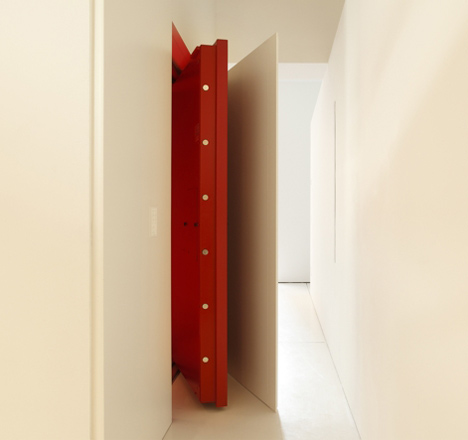
The cellar is exemplary and visually the strongest element, a real “container”: its iron cage supports two horizontal wooden surfaces and takes on the shape of inner shelves, closed off by ruby red panes of glass. The wooden latticework, which screens the panes of glass to avoid the effect of the light on the bottles, reinforces the alien character of this pulsating structure, parked at the bottom of the house.
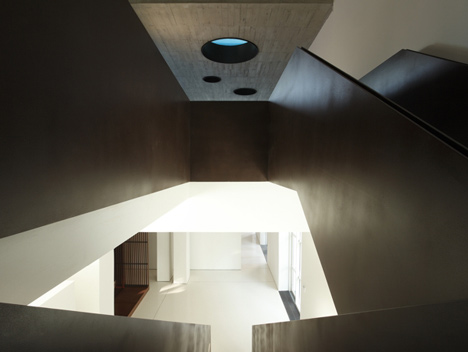
A long cor-ten staircase leads from here to the first floor, to be used as the living area and connected by another staircase to the second floor where there are the bedrooms and the swimming pool. Both floors are defined by an L-shaped floor plan: in the long arm (40m x 10m) there is a simple row of pillars , the short one (14m x 3m) forms a single bay.
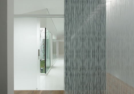
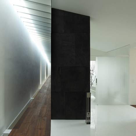
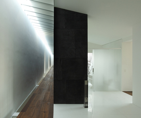
To underline the unbalanced ratio between length and width characterizing these spaces, a narrow opening has been made – corresponding both to the roof and the inter-floor gap. This aperture conveys light to the first floor, where the relationship of light with the exterior is also marked by a long (35 metres) cor-ten window.
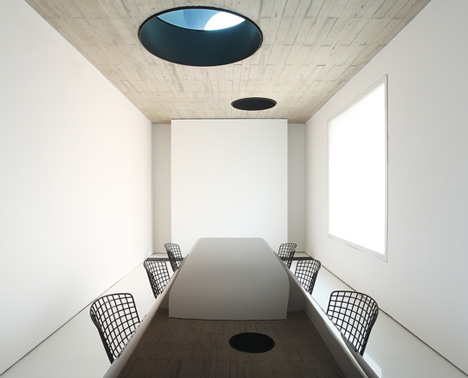
Thanks to the presence of slits, holes and long perspectives, these spaces can be perceived in a continuous succession, connected in a narrative route with a good rhythm. This aspect is particularly evident in the shorter arm of the L, where the spaces, on both the first and second floors, are to be mono-functional. The ceiling of the formal dining room is also the bottom of the swimming pool: its portholes look on to the long highly polished black table, plunging the dining room into the atmosphere of the upper floor and anticipating it in a suspended discourse of reflections and light.
Light
The theme-issue of light is a separate chapter in the development of this project: solutions that are never predictable were used to get round substantial obstacles: the building overlooks, unfortunately, the roofs of the surrounding buildings or the back of the nearby apartment blocks, which are all very high and completely blind.
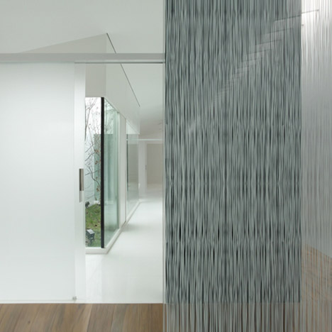
Exploiting light from above to the full by creating original paths to take it through the whole architecture is the central passage in an operation which guaranteed different luminous effects, giving the home a real variety of atmospheres, dimensions and suspensions. In two cases, the light comes from above into the glass parallelepipeds of the skylight wells, pierces the house through its floors and enters it together with a portion of the external space, with its plants and its seasons.
In another case, “informed” by portholes and coloured by metres of water, the swimming pool expands softly and densely into the dining-room below. Lastly, again from above, it works itself into the narrow slit corresponding to the roof and the inter-floor gap, slides along the walls and is released to be diffused on the first floor.
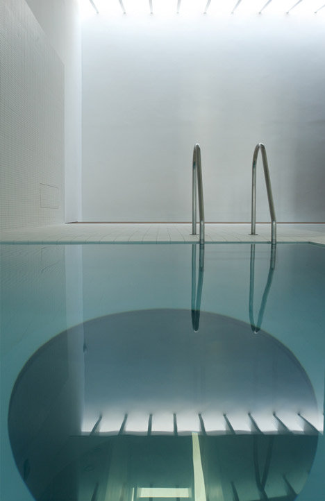
Regarding the access of the light from the side walls as well, despite the difficult position of the building, in some cases the indoor/outdoor relation has been designed with effective and specific solutions. On the first floor, for example, a long cor-ten window allows selecting the views and evokes the delightful image of landscapes impressed upon old photographic. On the bottom wall of the swimming pool, a large cone is directed outwards, defining with its black and enclosing frame, a portion of greenery and the blurred and iridescent light that can come from it.
Matter
On the second floor, in the bedroom area, three large cubes mark the space of the long corridor which leads to the bedrooms. Two are made of leather, one covered with the shiny side and the other with the darker and iridescent “back” of the leather, almost as though it were pigment. These are the most obvious signs of a discourse on matter which runs through the whole house, in a continuous reference to the once active and bustling world of work – craft and industrial production – in the area where the building stands.
If leather is a clear reference to what the building, a former tannery, was first used for, the interior is characterized throughout by an eclectic and honest unadorned use of matter. Stone, iron, concrete, wood, glass, felt and leather are used in such a way to make their natural essence felt amidst the things of the house and to highlight that they are raw materials, in reference to the world of work.
Sometimes this is done through successful contrasts, in lively dialogues between the materials and in unusual pairings. The best example is the formal dining room, which brings together very different surfaces and colours: the floor of Taxos, a Greek marble of a miraculous white, faces the exposed concrete that dominates it from the ceiling, whilst a lacquered table captures their interaction perfectly, reflecting it. The yellow, studded with travertine on the threshold of this scene, and the green of the soft light from the ceiling with the portholes, complete it, effectively highlighting the essence of every material.


所有评论