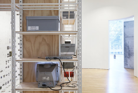
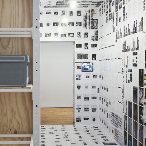
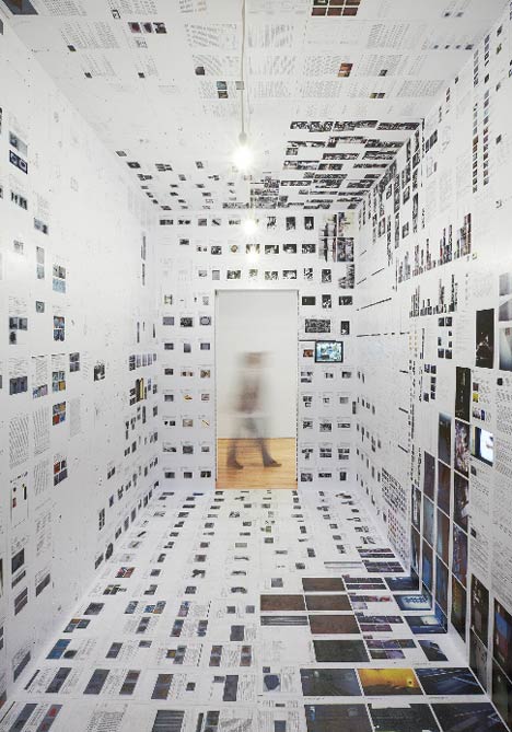
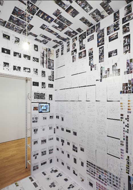
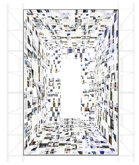
French photographer Julien Lanoo has sent us these images of an installation by Belgian architects Joris De Schepper and Thomas De Ridder at S.M.A.K – Museum of Modern Art in Ghent, designed to give visitors an idea of the museum’s work behind-the-scenes. A part of a series called Inside Installations, it focuses on what happens behind the scenes of an exhibition and the archiving process. Located in a large open space in the museum, a plywood box has been built in the corner and is surrounded by shelving units used to display some of the equipment that’s required to prepare an exhibition. The walls, ceiling and floor inside the wooden structure are covered with documents, photos, sketches and manuals relating to other installations being shown at the museum. Photographs are copyright Julien Lanoo. Here’s some more information about the project: task questions intention solution Click for larger image All documentation is related to installations that are shown on the exhibition. entering the room visitors will quickly recognize the objects, thus linking it to what they saw minutes before. Essential is that all walls, including flour and ceiling are treated in a same way, as if the common museum space has been inverted, turned inside out. Click for larger image The amount of documentation and the seemingly random organization represent the complexity of installation art. But when you look further youʼll start to find out that the shown information is organized, youʼll see repeating layoutʼs and document structures, discover video-interview with artists and glass-boxes with art-specific restoration material. Click for larger image situation Click for larger image construction Click for larger image architects Click for larger image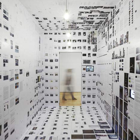
In an the 2010-2011 exhibition ʻinside installationsʼ the public should have a view on what happens behind the scenes of SMAK, more specific on the complexity of installation art.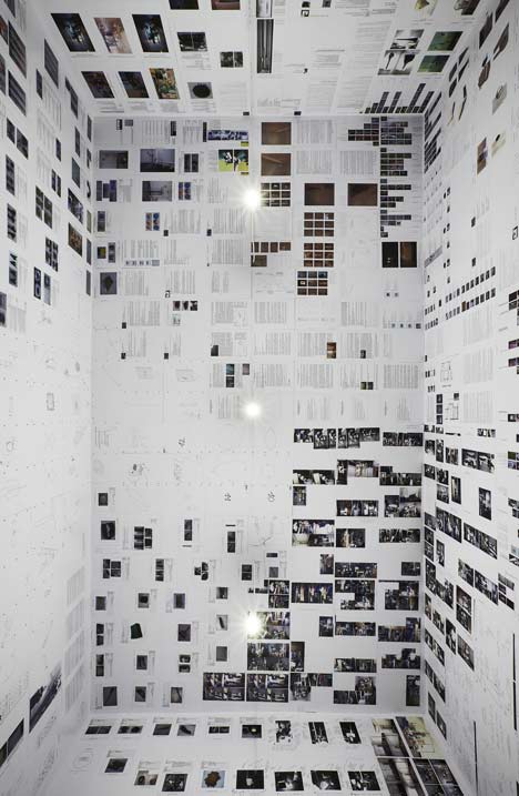
whatʼs specific about installation art? how to show information during the visit of an art exhibition? information as a negative of an art object which effort can we ask of a visitor, can we demand any effort at all? if thereʼs one thing weʼd want a visitor to understand and remember, even without actively visiting the information space, what would that be?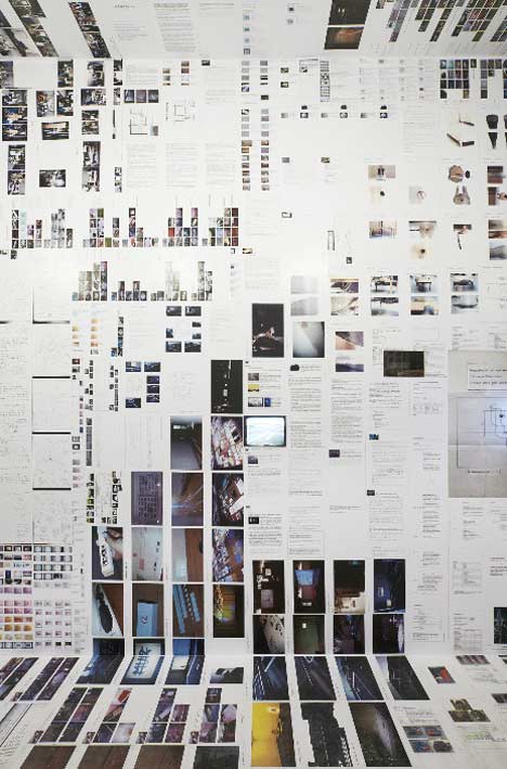
we wanted to work with different accessibility levels to reach people who are interested and willing to do an effort, people who are not willing to do an effort but also people who are not interested. Using architectural themes (space, light, structure, texture and context) we tried to attract visitors and make things clear in an obvious way. we didnʼt want a didactic space. on the other hand we wanted to allow researchers and interested visitors to find detailed information. the visitors decide how much information they see.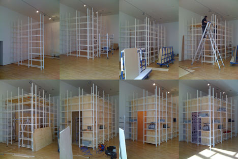
all information is being used as wallpaper for the documentation room: texts, photos, video screens, artist sketches, manuals, restoration objects. the information can be organized into 4 themes: research, conservation and restoration, exhibition production, package and transport.
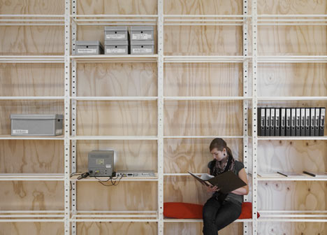
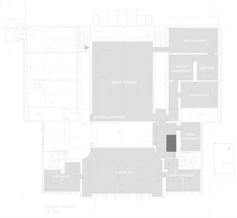
located at the big central void of the museum, with views on the entrance hall halfway the visit of the exhibition, maybe a moment to rest and look around. not a flexible white box due to a lot of circulation space, but very interesting as a social meeting place during the exhibition. Two benches allow people to rest, talk and look into original documentation folders.
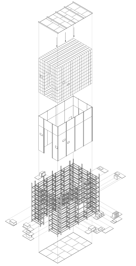
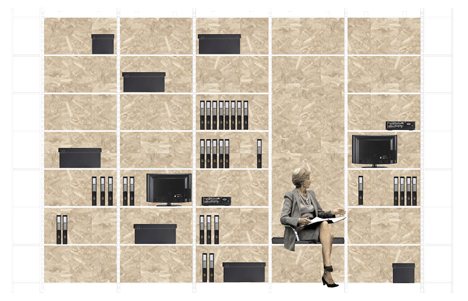
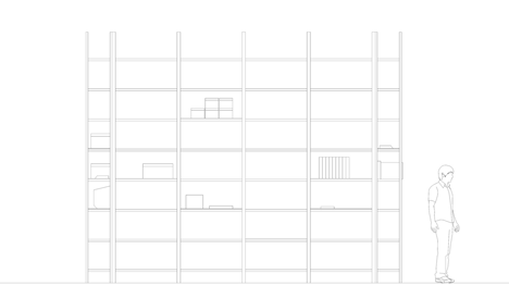
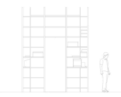
The room is constructed with industrial shelves and plywood. The paper (laserprints) at the inside is finished with glue and varnish. The outside doesnʼt have any finishing: the shelves, tv-sets, dvd- players, boxes containing restoration material and cables are all left visible. At some point the shelves are removed to make space for a bench (including red cushions). With some leftover shelves and plywood another, bigger bench was made next to the void.
We are Joris De Schepper and Thomas De Ridder, both architect. We studied at Sint-Lucas Architectuur in Ghent and work as architect since 2008.


所有评论