toronto is canada’s largest city and the birthplace of
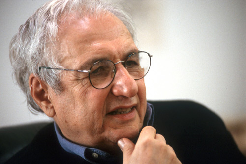
architect frank gehry. gehry was born into a jewish
family living in one of downtown toronto’s immigrant neighbourhoods. gehry would often visit the food market
with his grandmother or spend time building things from
scraps at his grandfather’s hardware store. as a child,
gehry also visited the nearby art gallery of ontario,
which was only a few minutes from his family’s home.
although gehry moved to california in 1947, he would
later return to toronto to re-design the very gallery he
visited as a child.
history
the art gallery of ontario (AGO) was founded in 1900 as
the art museum of toronto by a group of private citizens.
it was later renamed the art gallery of toronto in 1919 and became the art gallery of ontario in 1966. the AGO moved
to its current location in 1911, occupying a building known
as ‘the grange’. since then, the building has also gone
through seven different iterations and additions beginning
in 1918 with a beaux-arts style building designed by
pearson and darling. more renovations were completed
in the 1920’s, 1970’s and the final one in the 1990’s by
barton myers.
despite its most recent renovations and additional space,
the gallery continued to grow and more room was needed.
in 2002, publisher and art collector ken thomson donated
his 2,000 piece art collection and 100 million CAD to the
AGO. the gallery knew they needed to expand in order
to house this sizable donation, so they began to search
for an architect to realize their vision. they called on gehry, who jumped at the opportunity to re-design the AGO,
what would be his first project in canada. the AGO,
along with thompson, began closely collaborating with
gehry on an addition to the gallery. in 2004, gehry
unveiled his design and construction began on the
ambitious project. sadly ken thompson passed away
in 2006, before seeing the project he initiated come
to fruition.
the first consideration gehry took into account was finding
a way to unify the disparate areas of the gallery that have become a bit of a hodgepodge after six previous
renovations. gehry was also very attuned to the needs
of the local residents and the gallery’s surrounding environment. while gehry always aims to be respectful
to the context of his buildings, he paid extra attention on
this project because of his invested relationship to the
gallery and neighbourhood. the most important
consideration for gehry was the art. he wanted to create
a building that served to enhance the art, not hurt it.
transformation AGO
after seven years in the works and a budget of
276 million CAD, the new gehry-designed AGO was
unveiled on november 14, 2008. gehry’s design is
multi-faceted and evidence of his creativity is visible throughout the building, both inside and out. gehry’s
design for the AGO has already been given critical
acclaim by a number of well-respected architecture
critics, including the toronto star’s christopher hume
and the new york times’ nicolai ouroussoff. local critic
hume states, ‘to put it simply, gehry's revamped AGO
is a masterpiece, but just as important, it is the easiest,
most effortless and relaxed architectural masterpiece
this city has seen.’ from new york, ouroussoff writes,
‘its interiors underscore one of the most underrated dimensions of mr. gehry’s immense talent: a supple
feel for context and an ability to balance exuberance
with delicious moments of restraint.’
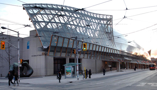
from the outside of the gallery the most striking addition
is the long glass façade that covers the galleria italia on
the north side of the building. below the glass wall,
the gallery’s main entrance has been re-aligned with the
center of the building. at the gallery’s south end,
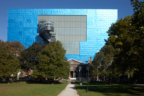
gehry added the largest addition to the gallery through
a new wing. this south wing is clad with blue-tinted
titanium and house the gallery’s contemporary galleries.
this wing is also pierced by two cantilevered serpent-like staircases on both sides.
upon entering, visitors will see that gehry has grouped
the gallery’s bookstore, restaurant, theatre and café to the east. this commercial hub also includes the AGO’s free contemporary gallery. the atrium is linked to the gallery
by a set of stairs and a winding ramp that snakes around
an opening to the galleries below. directly ahead,
gehry has restored the historic walker court. however,
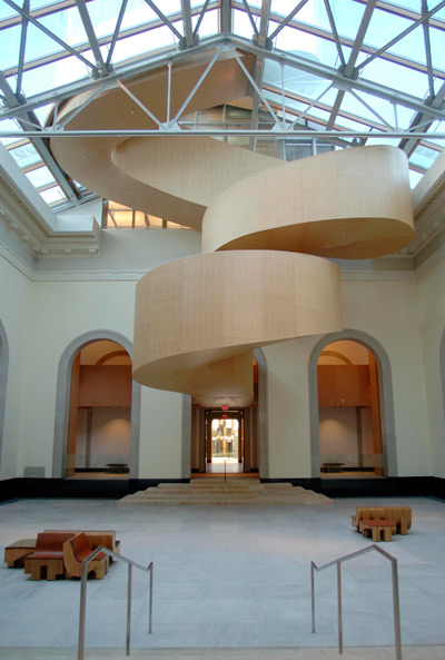
the new walker court is anchored by a wood panelled
serpent-like staircase, which breaks through the glass
ceiling and joins the exterior stairs on the south wing’s
north face.
inside the galleries, gehry has exercised more subtlety
giving many of the old european galleries and henry moore wing only minor upgrades to tie them into the overall
scheme. however there are many spaces where gehry
had room to play. the new gallery spaces like the glass
façade galleria italia and south wing galleries demonstrate
this freedom. gehry also designed a series of seating for
the gallery, producing chaise lounges he named ‘adam’
and ‘eve’.
despite the seemingly disconnected nature of gehry’s additions, the gallery is now fully unified with a harmonious flow. overall, the new transformation added 97,000 square
feet of space, increasing the available gallery space by
50%. as such, the gallery remains one of north america’s largest museums, now boasting a total of 583,000 square
feet of space.
walker court
thanks to the relocated entrance, the walker court,
the historic heart of the AGO, now lies at the centre of
the building. gehry has restored the court to its original splendour, adding a glass ceiling that floods the space
with light. the court looks out toward the street level
entrance to the north and the original grange building to
the south, which now serves as the member’s lounge.
wooden walkways surround the court and let visitors
peer down as the walk between galleries one floor above.
at the far end of the court, gehry has added a spiralling staircase that is enclosed on all sides. the douglas fir clad stairs spiral straight out of walker court, breaking through
the glass ceiling. once outside they morph into the metal staircase that is connected to the contemporary galleries
in the south wing.
galleria italia
the new galleria italia is located on the second floor at the north end of the AGO. the gallery was named after the 26 toronto families of italian descent who each contributed 500,000 CAD to the AGO building project. this gallery stretches the entire length of the AGO with its long glass façade anchored to a ribbed wooden structure. the façade measures 137m and overhangs the sidewalk below.
the glass curves toward the building at the top,
resembling an overturned canoe. the angle of the glass reflects the old victorian row houses across the street
from the gallery, juxtaposing the old and new. at each
end of the glass span, sections appear to be peeling
away from the structure, like sails caught in the wind.
inside the glass façade, a sculpture gallery is bathed in
natural light. stretching the entire gallery are massive
wooden beams made from douglas fir that resemble
a ribcage. this extensive use of wood gives the gallery
a natural warmth that humanizes the space. the glass
wall also allows visitors to peer out into the street,
highlighting the muted flurry of activity below.
south wing
while the galleria italia may be the most iconic section
of the new addition, the south wing is its most expansive.
the wing features four stories that overlook grange park
to the south. the main level features a glass enclosed sculpture atrium which is link between walker court and
the grange building’s member’s lounge. above the atrium
is the first of three levels that are clad in the blue-tinted
titanium and glass curtain. the large glass windows on
each level have again been humanized with a series of horizontal wooden louvers. on the top floor, large skylights funnel light into the galleries. these upper floors are
connected by a 1.5m spiral staircase that features
windows on all sides. inside the galleries, gehry
conceived of a space arrangement that features many
small intimate galleries within the larger space.


所有评论